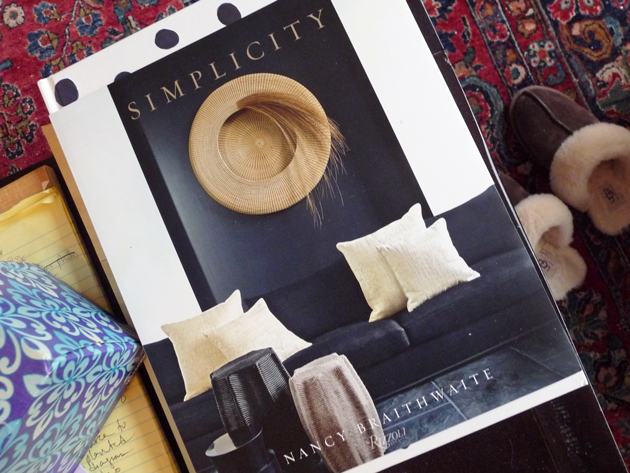
As I have said before, interior design scares me. What to wear? No problem. What to plant? Lots of suggestions. How to furnish a house? Yikes.
I’ll come right out and admit that ever since I decided to update my house I’ve been dithering – bedroom furniture, front doors, cushion colors for my living room – what to choose? So when I saw this book reviewed – somewhere – I clicked over to buy it so quickly I can’t remember who to thank for the recommendation.
In any case, thanks. I’m talking about Nancy Braithwaite’s manifesto Simplicity, on her interior designs. It’s large, full of images, beautifully presented, and currently occupying a place of substance on my coffee table.
The book is more than pictures, visually spectacular though it may be. Nancy details her guiding principles, or as she calls them, Design Elements.
- Architecture
- Composition (Her thoughts on repetition and symmetry, exemplified throughout the book, struck me particularly.)
- Proportion and Scale (Again and again she uses few objects in surprising sizes, vs. multiple common objects, to make the aesthetic statement, to turn a room into art.)
- Color
- Pattern
- Texture
- Craftmanship
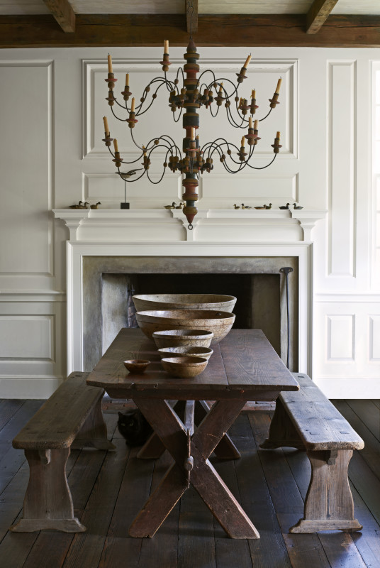
Although I imagine these terms are predictable to anyone versed in the field, I found them revelatory as a framework through which to experience Nancy’s rooms. Here, see how the contrast of the ornate chandelier shape against the straight-lined table is made richer by their similar textures.
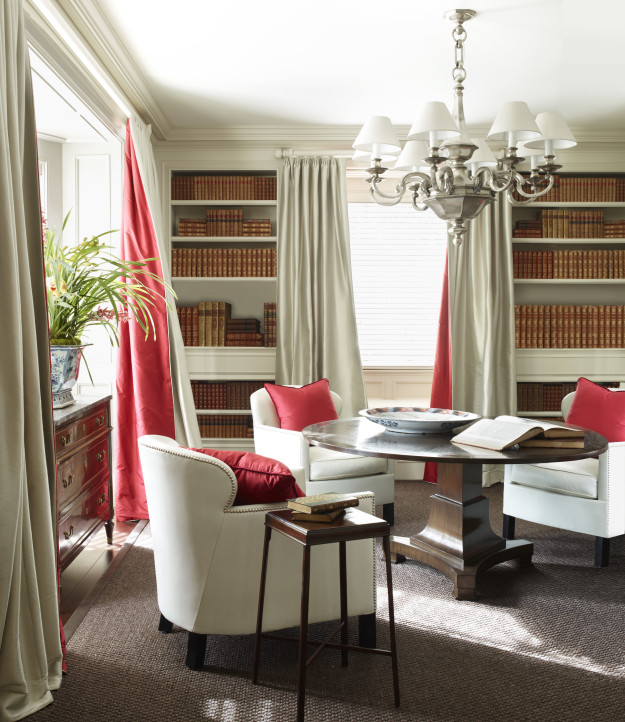
And then the simple surprise of coral-lined curtains, the audacity of repeating the audacious color on so many cushions. Yes, I am repeating words. Might not work in writing as it does in design, but unless you break rules occasionally you never understand them.
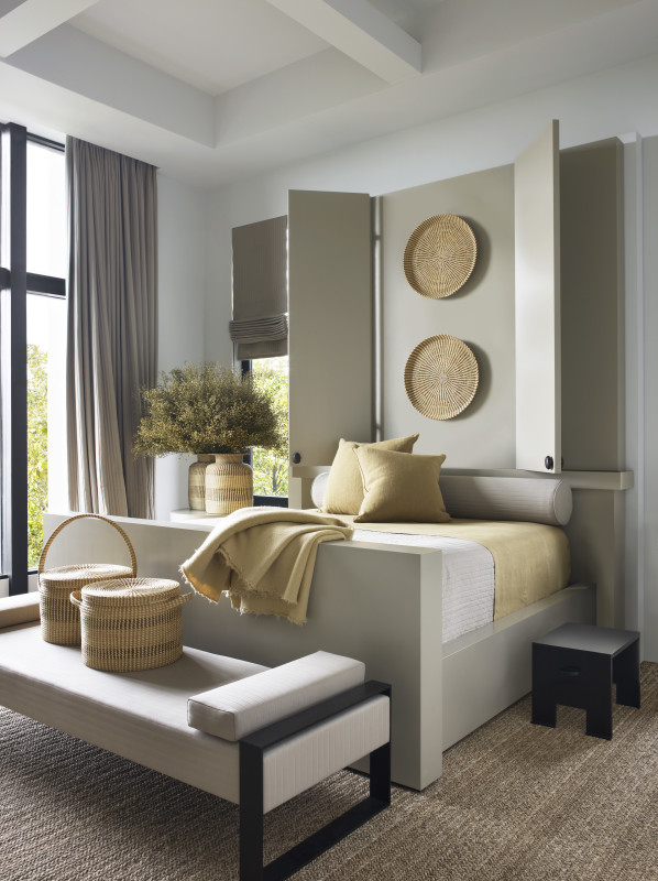
Reverence for a throw blanket, an embrace of things round, the glories of tall simple windows and their tall simple coverings.
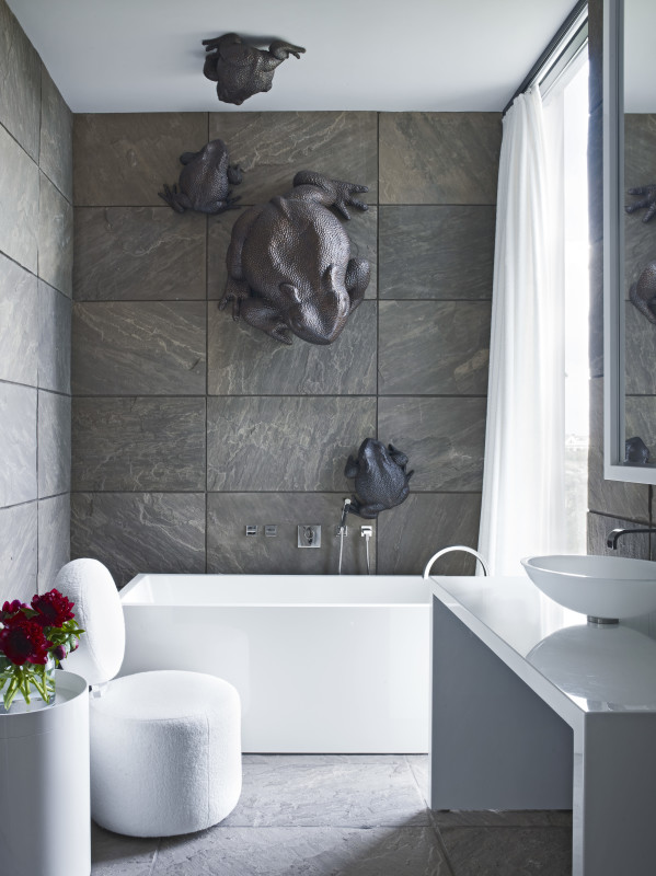
I mean, I never thought I wanted metal sculptures on my bathroom wall but I was wrong. The biggest frog at the top, rather than the bottom, turns expectations – and amphibians – upside down.
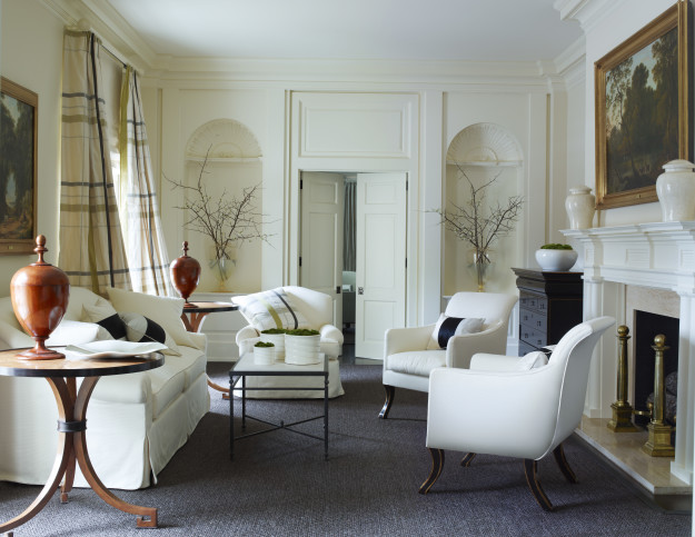
However, this living room was the final hook in my heart. Do you guys notice all the white? Huh. And yet so rich, so warm. The peaceful plaid curtains? Peaceful Plaid – oxymoronic design for the win. How about Serene Abundance? I think that’s my phrase, guys. I think that’s what I want. The interior equivalent to Polished Tomboy.
Most of all, Nancy seems to have led me to understand the role of inspiration in home design. While I’d always been able to browse fashion and take away only what I needed, I found interior design overwhelming, and so could not abstract out my real choices from fantasy pictures.
I have no plans to replicate Nancy Braithwaite’s designs – don’t have the funds or the discipline. But she works with such bravery, I may be able to muster a little of her courage.
Affiliate links may generate commissions
51 Responses
Beautiful rooms and not over-decorated. And- you have to start with good bones, like those gorgeous windows. (Window size, type and distribution is, to me the most important element in design. Without decent windows, you’re cooked before you start.)
@Duchesse, Interesting – in California we tend towards windows everywhere, and maybe don’t notice them so much because it’s so often light? That said, I agree, good bones are wonderful.
The living room reminds me of the interiors of Mariette Himes Gomez, who also uses a lot of white and is an expert at creating elegant rooms. As for those frogs, I’d be terrified to take a bath!
@karen, I looked at Hines Gomez’s reviews on Amazon. So interesting the way people respond – similar to responses to Braithwaite – people find her too formal and cold. It’s funny, maybe because these designs are so uncompromising I find them easier to absorb as inspiration.
The pictures were superb.
My problem regarding interior decorating, is, that I love many, diverse styles. For example, I see pictures of French country kitchens, and I want rooms like that. However, when , a couple of years ago, I visited Russia’s Hermitage Museum with its gold-encrusted rooms including golden angels on the ceilings, I loved that, too.
.At the moment, my sitting-room is decorated in Vintage Wal-Mart style. Until I can fix a few golden angels on the ceiling.
@helen porath, Golden angels sound, well, divine:). And I have no named style I like either – just an aesthetic, if that makes sense.
You may also find inspiration looking at the interior style of Katie Ridder.
Personally, I would find the frog bathroom horrifying.
@Karen, I think I’ve also looked at Katie Ridder’s site, but maybe I should move to a book. So many more images at such higher quality. And I might find the frog bathroom difficult in real life – I mean, how many times would I want to bathe with frogs – but I still find it supremely inspiring. Which is what I have been missing!
Katie Ridder’s house was on New York Social Diary last week, so you might check that out.
I think I could spend the rest of my life wih that living room, although I’m with Helen in that I love too many diverse design styles–need a few houses. I especially like that she embraces symmetry. I’ve always felt like an unimaginative type for my love of it. Thanks for sharing this beauty with us. P.S. Monster frogs overhead–NOPE.
@Linda, I had the same reaction to her use of symmetry and repetition – that’s my instinct and it was so wonderful to see it used in an avant-garde rather than conventional way.
I love the images you’ve chosen for this post and now want to see this book. I have so much trouble with interior design, but I think its just letting myself wrap my head around it rather than ignoring it. I like the clarity and yes, even the symmetry of these designs, even though I tend to be not particularly drawn to symmetry overall. More exactly, I think it depends so much on the bones of the structure, and have finally recognized that what I might love in one space I might hate in another, if that makes any sense. I wonder if that means I can claim some sense of eclecticism or if I just have no style at all.
@Mardel, I was having real trouble wrapping my head around it too, in part because I found so few images that I actually liked. I prefer these, which I would clearly not live in, to pictures that try to get closer to real life. Because they almost always get it wrong – for me.
@Mardel, Yes, Lisa, that is it exactly.
Serene Abundance is good. More Abundant Restraint to my way of thinking. Nothing is haphazard; everything has been thoroughly thought out, selected, edited. Curated. It is a fabulous inspiration pic.
The scale, proportions and symmetry going on in the white room are dang near perfect. Even so, if this room did not have the ceiling height and the classic architectural elements it would still be beautiful.
While funds are always a consideration, I am quite certain you have the discipline to accomplish whatever design you have in mind!
@Linda Pakravan, I am so pleased you approve! And thinking about your comment, caring enough is probably more the issue than having the discipline. Some part of my interior design self-talk seems to involve the statement, “Oh good lord I just don’t care that much;).” I’m impatient, and I can make that work with clothing, but with houses, I’m having to really watch myself. Often watch myself make mistakes. Ha!
Hello Lisa, Very interesting images and comments. I agree with Duchesse; note that each of these rooms has considerable built-in architectural interest and features. Some simple designs superimposed over a very plain room might not work as well.
–Jim
@Parnassus, I hadn’t focused on that, but, I think you are right. Fortunately my house has a fair degree of architectural stuff going on, maybe that’s one of the reasons I like her photos.
Love simple,uncluttered and good, clean lines. Don’t want frogs of any sort in my bathroom.
@Mary Anne, Aw. I have a soft spot in my heart for frogs;).
I love the photos and the designs. Although Braithwaite is basically simplistic, somehow she manages to interject such warmth into the rooms. Her simplistic approach, somehow becomes surprisingly eclectic. It would be so easy to live with.
@E. Jane, That’s what I think too. If lived in, of course, the usual clutter of life would spread across the scene.
I am a big fan of the australian design blog, the Design Files. I think our aesthetic works well with California homes because of our similar climates. She runs a home of the week every week – I don’t always love them but I always like to see how other people arrange their homes. I also like Megan Morton’s design advice – she is incredibly generous of her knowledge and experience. Worth looking at on instagram.
@amanda green, I will check the Design Files. Australia and California do share a lot – the light in particular.
Looks like a wonderful book and I like her approach to decorating…
and it’s not too fussy, I could ba content and relax in rooms like these.
Do dhow us how your projects are coming along…the native plants and the bedroom…oh and the front door!
@hostessofthehumblebungalow, I’m made the most progress on the garden:). I’ll show some photos soon.
Lovely pics (though I agree those frogs are a bit too realistic and squidgy-looking).
I also agree with those saying the bones of your house define quite a bit of what you can do. My ideal style would be a toned down ‘French’ romantic style with washy colours, lots of mis-matched antiques with gilt, glass and polished wood floors. But I wouldn’t attempt to put that into a very modern house.
My house in New Zealand was built in 1980. My decorating was mainly constrained by cost so I was stuck with the blue carpet (I know!) and yellowy cream walls. I kept the rest of the furniture etc. neutral with browns, creams, clean lines, plain colours not patterns.
We’re looking to buy a house this year so I’ll look forward to being able to do a few bits, as money allows…
@Eleanorjane, Part of what makes this hard for me is that I do like to mix styles – so there are way too many choices.
Oh that dining room! On interior design, I am the opposite. I’ve always known what I wanted. True, I might need three houses to accommodate it all but I am making due with one for now.
@Stephanie @ La Dolce Vita, :)
Hm. I find the photos a little on the dull side. But then, while I consider myself a modern and fairly minimalistic girl, I decorate my home like I decorate myself…fairly neutral palette (walls, floors, big items like sofas) and then fun, interesting, sparkly. colorful touches in what the design world calls “smalls”. There’s not quite enough personality in these rooms for me.
@Jill, That is so interesting! To me they have almost more personality than I could live with!
Oh that living room…absolute perfection. I love this aesthetic so very much. I’m glad you’ve found a decorating “spirit animal.” :-)
@déjà pseu, Thank you. I was clearly in need of some kind of guide:).
I’m not a fan. I find the rooms void of personality, and similar to a nice hotel lobby. Very staged, like what are the baskets doing on the bench on the end of the bed, and where are much needed nightstands? And the frogs…..positively scary. I do like both the plaid and the coral lined drapes though.
@kathy, Interesting! I like that very “museum” quality to the photos, it allows me to see the principles of the aesthetic, and not get lost in thinking about what I would or wouldn’t want in my house itself.
Looks like a lovely book. One of my New Years resolutions is to better my coffee table book collection, so this might be a nice place to start. (I’m a sucker for simplicity in interior design, probably because mine are so cluttered!)
~Sophia
@Sophia, It is. And beautifully designed – the dust jacket is only 3/4 the size of the book, those polka dots are the book, the furniture the cover.
Bold, beautiful and not too fussy. Love this style!
@Kathryn, Definitely not fussy!
It’s in my cart at Amazon! This is the direction I’ve moved in for the past 5 years, and moving to a beach house sealed the deal. Lovely choices, Lisa! You sound like you’ve got a clear plan in mind.
@Mamavalveeta03, I do have a plan:). And I would love to see a beach house in this style – with all the softening coming from collections of beach glass, or towels drying on the deck:).
I’m in the process of decluttering our home, so these pics are inspiring! They manage to look both spare & warm. I think decluttering is a more reasonable goal than getting completely uncluttered for me & my husband, as we both have stuff we’ve collected & stuff from our families. Yes, I like the unexpected placement of the different-sized frogs–keeps the eye moving & can’t tell which is the floor or wall or ceiling (wouldn’t be good for someone with vertigo/vestibular issues!) I probably wouldn’t want them in my bathroom either (especially not metal, which would rust), but I think the concept would be great in a small area that needs some interest. (I’ll keep it in mind for our small hallway.)
@Megan, I think something like that on a hallway wall would be really cool.
Ah, I’ve loved Nancy Brathwaite’s work for years. I have a decorating book published in 1989 that shows her house – what she did with a suburban rancher was magic.
@Mary, I can only imagine. She talks about and shows her current house in this book too.
Lovely pictures and so inspiring! Decorating is a definite challenge especially if dear husband is not on the same page! Ah the art of compromise…
@Suz, The melding of two sensibilities.
My suggestion is to go to a large furniture store – one that sells many lines of furniture and has a design staff. If you buy your furniture there, the design services will usually be free.
Ask to see design portfolios and it’s likely there will be at least a couple of designers on staff whose work you will like.
I think it’s okay to throw in the towel on things that don’t come naturally and ask for help.
@Hmmm, If my top goal were to get this finished, I’d be leaning more heavily on help, to be sure. But I’m also trying to teach myself, to grow my aging brain. Kind of like ballroom dancing:). So I have to blunder around myself. I am hoping it’s useful for readers to see how/what I learn, or, if it isn’t, you all will tell me!
These are beautiful designs, I love that you useless colors as combination to make everything simple. Thank you for sharing this one.