Having come very recently to the idea that we design interiors, they do not accrete themselves, I’ve been researching shelter magazines and sites. If we can use the term “research” for browsing images, pinning, yelping “Oh that’s horrible,” browsing, yelping, muttering “Maybe this one is OK,” and pinning some more.
I grokked fashion mags. (Remember that word?) I understood that I preferred Vogue over, say, Glamour or Harper’s Bazaar or Lucky. I also understood that I didn’t want to dress like the models in Vogue, that their outfits created a system of crossed flashing and occasionally neon beams, like a light show at a Madonna concert, and it was up to me to figure out the real costume.
I am working towards a similar understanding of the world of shelter. So interesting that we nickname interior style with its most primordial function, right? Does that mean that the nickname for clothing style, AKA “fashion,” tells us that the most essential function of clothing style is la mode? Not comfort? But I digress.
Let’s ask ourselves now, which shelter magazine(s) are we? Let’s review a few images, in no particular order. I’m flustered by the difference in images sizes, BTW, but if the mags don’t want to help me make them look good, what can I do?
Martha Stewart Living
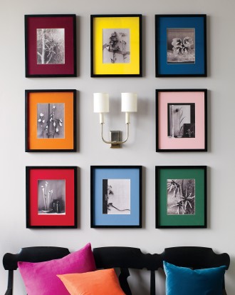
Cute, but too peppy for me. I don’t want my house to be happier than I am. Also, I would craft in order to furnish a room, but I would not furnish a room in order to craft.
Veranda
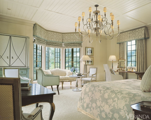
I see the appeal, but too much muchness. Often actualized in fabric, chandeliers, and swoop of all kinds.
Architectural Digest
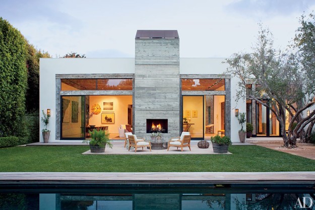
My mother has subscribed to AD forever, and my sisters and I agree that we’re going to like one space in every issue. Not a realistic sort of liking, i.e. “I could do that in my house,” but a “Yeah, sure, were money no object.” I haven’t yet figured out how to abstract out any lessons.
Coastal Living
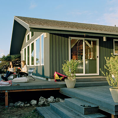
I love their exteriors. So far as I can tell, their interiors tend towards other regional styles than my own, i.e they focus on New England, the Southeast, the South.
Design*Sponge
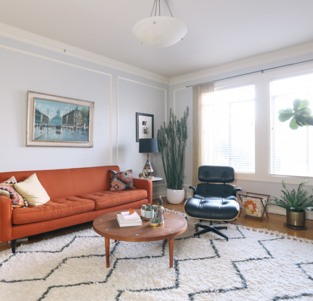
I speculate that this is a post-2008 look, a very hard recession having brought this eclectic, sparse approach to furnishings into our style lexicon. While I appreciate these spaces — particularly when they’re truly Craigslist and not faux upscale retail remakes of a thrift store aesthetic — in my house I like a little more plush and harmony. Where possible.
The World Of Interiors
So far from my world that I treat it as art. So do the publishers apparently, no tawdry Internet photos for them. Gotta embed the whole issue in the blog. I love their imagery, but I do worry a little about the homeowners, who often appear to be eating dinner surrounded by peeling paint and dust. Not good for the digestion.
Domino
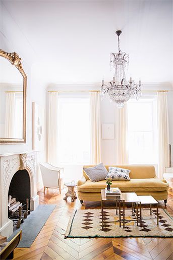
I find it odd and yet eminently reasonable that a site focused on actual purchase of house goods offers the interiors I like best. Over all. So far. I’m still mulling over eleventy-billion photos of Swedish apartments full of white paint and light. Work in progress guys, work in progress.
All photo links on my Pinterest board, here. I look forward to your thoughts, if you have a moment.

65 Responses
It’s hard to tell. When we moved back to Tennessee and bought our new house last year, we ended up in a much larger house than we had lived in previously. Also, all of the light in our new house is uplifting, but it shed a harsh light on the fact that all of our furniture was looking dingy. We hadn’t noticed for all of the bad light in our previously owned 1930s bungalow. Now we live in the burbs in a house built in the 90s with amazing light, but I’m in the process of trying to make the inside NOT look like the burbs. I call it “de-burbing.” It’s hard, because we don’t have that much money to be purchasing all new furniture. A work in progress. But it’s stark and white, which is a good start, and I like it. But I’m struggling to make it cozier. Time will tell, I guess.
“De-burbing,” I like that:). I think cozy does come best over time, after living in a space, rather than trying to manufacture it.
There are not as many shelter magazines as there used to be–and that is one reasons Pinterest is so great for seeing all kinds of interiors. I would have to say out of the magazines available that I like Veranda best. It can be over the top in terms of very high end, but it is usually quite tasteful–imho.
There is a new magazine that is quite beautiful–Milieu.
I used to lvd Southern Accents before the economic downturn of 2008, it was one of the most elegant magazines of all.
Since we live no where close to a coast, Coastal Living, while dreamy, is not appropriate for us.
Years ago, I drooled over Country Home–another magazine of the past except for some quarterly rehashes.
I will keep delving, into Veranda in particular. Do you subscribe to Milieu, if I can ask? These magazines are making the effort to firewall/monetize their photography, as well they might, given the expense of a good interior shoot.
I pick up our Canadian House and Home occasionally and like its variety — ranges from the attainable to the aspirational — also a nice mix of urban and rural and coastal to suit the huge diversity of our country’s geography. But honestly, I haven’t looked much at shelter mags since we did a huge house reno/addition many years ago. I can imagine plunging into them again when we make our next move. . .
@Frances/Materfamilias, I hadn’t looked at them in years – except when visiting my mom. When you make your next move, I hope you have fun!
I like Martha Stewart Living. I’m not a very successful crafter but I enjoy hers vicariously. Martha must have a serious shopping addiction. One issue had a room full of different silverware and vintage mixing bowls. I also like the recipes. If I’m on a long air trip and have already read Vogue, my airplane magazine of choice, I’ll buy an issue.
I took Coastal Living for awhile after acquiring a coastal home. They run a little cutsy. Then woman who has the house next to ours told me that everybody furnishes their beach house with Pottery Barn and I decided that was easy enough so I let Coastal Living expire.
I’m a steady viewer of Apartment Thearpy. It’s not a magazine and it’s not all that upscale, but I enjoy what scrolls by. I think I might be older than their target reader, but it’s fun to see the different things they feature, plus they have comments!
@RoseAG, I think I need to spend some time on Apartment Therapy:).
Love your comment on AD, as that is pretty much my reaction to every issue. As to other shelter magazines, I haven’t really found anything which consistently draws me in, although I haven’t looked at Domino in years. Perhaps more research is needed.
@Mardel, :)
I would love to be a “World of Interiors” kind of gal but my budget does not allow for the sort of architecture that makes peeling paint look chic. I think I am a “Domino” type also.
All of these ideas come easily for me and I get it that some people struggle with the endless choices. It is good that talents are varied and even better that you are exploring something new. Ask me to use a spreadsheet and I will be in frustrated tears in minutes.
@Kerry Steele, Spreadsheets were my nemesis in corporate days:). I can tell that these ideas come easily to you:).
Did you delve into House Beautiful? It doesn’t have the personality it once had, but the Q&A interviews with the designers of the featured homes can be educational and entertaining. I still mourn the loss of House & Garden.
@Beckie, I have trouble with their site! So. Many. Popups:(
@Beckie, I actually e-mailed House Beautiful once to complain about how horrible their web site functioned – or didn’t function.
Very frustrating. Very nice magazine though if you love color.
Okay, I am officially confused- is that first photo Martha Stewart? It looks like a bathroom to me. I see no references to craft(s)? Help!
@Kathy, A bathroom? Surely you jest! It’s a gallery wall, the craft is the matting on the photos. All links on my Pinterest board – I admit, I was lazy on the link-building this morning.
@Kathy, @Lisa, believe me when I say that originally the first photo shown onto screen was of a bathroom ( yours I believe) with gray tile. Glad I checked back to see the Martha Stewart gallery!
@Kathy, How weird! *gremlins*
Although I love Coatal Living, it doesn’t fit where live. Veranda can be lovely, if somewhat pricey. I’m so minimalist, most of the shelter magazines make me hyperventilate. Guess I’m no help to you here.
@Mary Anne, It’s OK. Good company counts as help:).
It amazes me how long the blog “desire to inspire” has kept its promise to me….
@rosekraft, I’ll take a look!
It says something (not useful to you) that I have never heard of several of these.
@Cathy, Hehe. Still useful, to know the general level of awareness.
I like Elle Decor, although the people featured in it often annoy me. They seems so full of themselves. I used to enjoy Southern Accents when it was still around. I am also attracted to Country Living – so cozy feeling. AD interiors are just so unattainable but, I guess, aspirational.
@Jane, Hahahahaha! Annoying people certainly have a multitude of ways to get heard these days:).
@Jane, Oops, that is “seem” not “seems” – forgot to proofread :(
Oops. Sorry, Lisa. I’m a print magazine person, and was referring to the print version of House Beautiful. Not many decor magazines translate that well digitally. Yet.
@Beckie, I was noticing how poorly they were making the transition. In a way, the Issu software is the best solution, if they want control over their images, even though it’s kind of annoying.
English Home works for me. I’m too Irish to be an Anglophile but I enjoy their emphasis on comfort over perfection. I love that if you look carefully, you can spot chipped baseboards and worn floors.
@Meg, English Home. Off to look.
I used to gravitate to Traditional Home and Colonial Homes. Then I realized I almost never change anything in my house, so I wasn’t sure it was time well spent.
@DocP, Ha! So true. I’m really surveying these magazines now so as to guide my house fixup.
Once upon a time, a friend gave me a subscription to Cottage Style (I believe that was the name…or was it Cottage Living? It’s been awhile.). Alas, it folded.
I just don’t look at any of them any more. I also rarely look at cooking magazines (I used to be an addict). Changes….
@Jean S, Changes can be wonderful.
I subscribe to AD and Traditional Home, which is now mostly a nice mix of traditional (American/English) traditional and more contemporary global aesthetics. I like House Beautiful, too, although not enough to subscribe. Veranda is lovely, but too fancy for me. I miss Southern Accents and HG, with its incredible editor Dominique Browning, and although I love Pinterest in small doses, I find Houzz to be overwhelming.
@Town and Country House, Houzz might do well to find ways to sort or configure its content – at least the RSS feed is like a firehose.
Like Frances, I used to pick up Canadian House and Home until a few years ago when I finally realized I didn’t much care for artfully decorated spaces. I think it was the surreal illusion of tranquility, and the not-quite-human beings who would inhabit such places, that eventually got to me.
@Marilyn, I always wish the magazines were willing to show a more realistic view into interiors – fewer throw blankets, and stacks of books with a perfect flower.
I enjoy Elle Decor and Veranda/Traditional Home. Yes, to the old HG – my favorite part was reading the letter from the editor!
I have an Elle Decor from 2003 with Bunny Williams apartment in NY as a feature. I still look at it! Ditto on the AD that featured Brooke Shields in her NY home.
Bunny Williams’s …..Bunny Williams’? I avoided the problem with Brooke, but forgot with Bunny!
@Kate, I didn’t know off the top of my head:). Seems like Williams’s is generally accepted:).
Hello, hello! Long time, no comments from the peanut gallery over here, but I’ve been enjoying all of your posts and the variety of subject matter.
I love World of Interiors for the visual feast and the tactile pleasure, though it doesn’t remotely translate to the real world. Ditto AD, though I agree that there’s usually one spread that resonates. I read Elle Decor (US and UK versions), House Beautiful (again, US and UK), House and Garden (UK), Living Etc. (UK), and my favorites, Vogue Living Australia and InsideOut (also Aus.). The Down Unders have a delightful sense of color and daring. As a foreign magazine habit can get rather pricey, I only buy the issues that jump out at me when I riffle through them.
@Debbie (Artsy in Boulder), Hi there Mme. Peanut! Nice to hear from you. I think I’m going to have to go to my local indie bookstore and look through some print. It’s been a while!
With my father begin an architect, I grew up on Architectural Digest. Our last time together we looked through the most recent, and he pointed to a beautiful woman in an ad and said I looked like her. Cherished memory for sure.
I subscribe to Cottage Living and Traditional Home, and will be subscribing to Veranda soon. Was a Martha fan in the beginning – have her first Entertaining and Weddings books. Lost interest when I tried a few of her recipes and they didn’t turn out!
Doesn’t your brain start swirling after a while of perusing?
@Candace, My brain shuts down after too many pictures! I have to dose myself like they are drugs. And that’s a lovely story about your dad.
I used to subscribe to Sunset magazine. I liked the clever remodels, the recipes, and western travel ideas. Then the remodels seemed impossibly extravagent, and I stopped my subscription.
@AK, I haven’t looked at Sunset in a long time. Used to get it as a gift subscription from our realtor, when we first moved into this house. But that was an exceptionally long time ago:).
I never, ever read any of these magazines anymore, as I used to pour through them when I worked as an interior and architectural designer. I find them so nerve-wracking as I associate them with a profession I didn’t enjoy all that much.
Ideas for homes come easily to me, and I do love to help friends figure out their places of shelter. Oddly, I don’t get a bug to re-do stuff in my home ever. I love what I have, it’s worked in homes over the years, and dread when I have to recover something.
I wish I was that comfortable with my wardrobe and accessories……
@kathy, I imagine that your former career gave you the skills to pick exactly what you like, and obviated the need to try them out repeatedly:). BTW, the idea of a work uniform is quite the thing these days.
I haven’t seen a copy of Domino in ages, but do remember that I generally liked their aesthetic.
@déjà pseu, :)
So timely! This is a topic of obsessiveness for me these days I look for inspiration in making our recently remodeled house cozier and less raw looking. Lots of interesting leads here, and plenty of magazines that I’ll have to track down now.
I used to be a big fan of Martha Stewart’s magazine, less so now. A house “happier than I am” is just too much! I like House Beautiful but find that I’ll only respond strongly to one or two houses in any given issue. Too stark; too precious; too much. Domino can be fun, but really, can’t they paint a wall some color other than white? Have you looked at Remodelista?
Maybe it dates me to write this, or maybe it’s my aging eyes, but I do prefer print magazines to digital. And I STILL miss the old House and Garden.
@Kathy DiGi, I have looked at Remodelista – in my RSS feed it didn’t compel me too much. But I’m planning a trip to the bookstore for a whole pile of print, soon.
I love your mom’s living room from an earlier post. I think you described it as “eclectic High Wasp” and it looked ever so comfy.
I like a room that makes you feel relaxed and also gives a sense of the owners lifestyle and personality.
Thank you. It is ever so comfy, but also really elegant. She had pieces custom-made, worked with a designer, etc. And used furniture from her family, from California, and from Sweden as well. Kind of the perfect storm:).
Southern Accents was my all time favorite. I still miss it! Second place belongs to Veranda which is a feast for the eyes. I enjoy flipping through Sunset to see more practical and attainable designs, but it doesn’t make my heart skip a beat like the first two :)
Do you feel that Garden & Gun meets the Southern Accents need at all?
Until they ended it last month, I greatly enjoyed the NYTimes Thursday home pages which featured many small pictures of actual homes not editorially styled, but as they are actually lived in. I have a secret love of British and French magazines, both fashion and shelter, and if I indulge thats usually where I spend my money. It fits with my preference for old things that reflect my own life and family story.
I think many people agreed with you that it was sad when the NYT quit Home.
Lisa this cracked me up. You are so spot on. I love Domino, but yes every issue has the same white interiors just redone with more colorful accessories, but somehow I am drawn to it. I finally broke down and subscribed to Canadian House and Home since I was already buying it each month. It’s pretty good and I still love House Beautiful, though it’s changed a lot. Veranda is pure model home which I find uninspiring and Elle Decor occasionally is pretty good though. Hope you are having a good weekend! Kim
Oh I am so glad to make you laugh! And I’ll totally go peek at Canadian House and Home.
Lisa, I’ve seen too little of Garden & Gun to render much of an opinion on how it compares with Southern Accents. While the “Garden” entices, the “Gun” has probably caused some hesitancy on my part. But I’m a sucker for a beautiful interior and if Garden and Gun delivers, I could be won over in a heartbeat :)