Having examined, in the recent past, cultural identity, I thought we might move on to house style. As one does. Who among us has not undertaken Cosmopolitan and Glamour quizzes purporting to explain ourselves to ourselves? Who among us has never succumbed to a Facebook slideshow in an attempt at the same?
So, What Shelter Magazine Are You, v.2? (We’ve done this before, a while back)
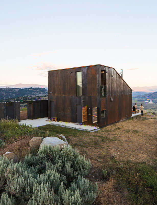
How about Dwell? I love the minimal, rustic, craggy-vistaed look, but, since I don’t have a pristine grassy plateau available at the moment, I can’t say this is me. Impractical.
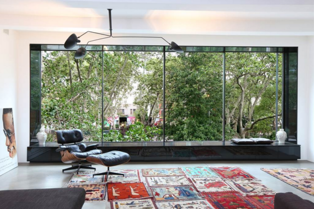
Elle Decor? I love the photo below, but I realize that in this case, the outdoors makes the indoors. Insufficient chairage, if one wants to do anything other than stare out the window. For example, talk to other people. And by the way, Elle’s sourcing a Sotheby’s house tour. Guys, the world is changing.
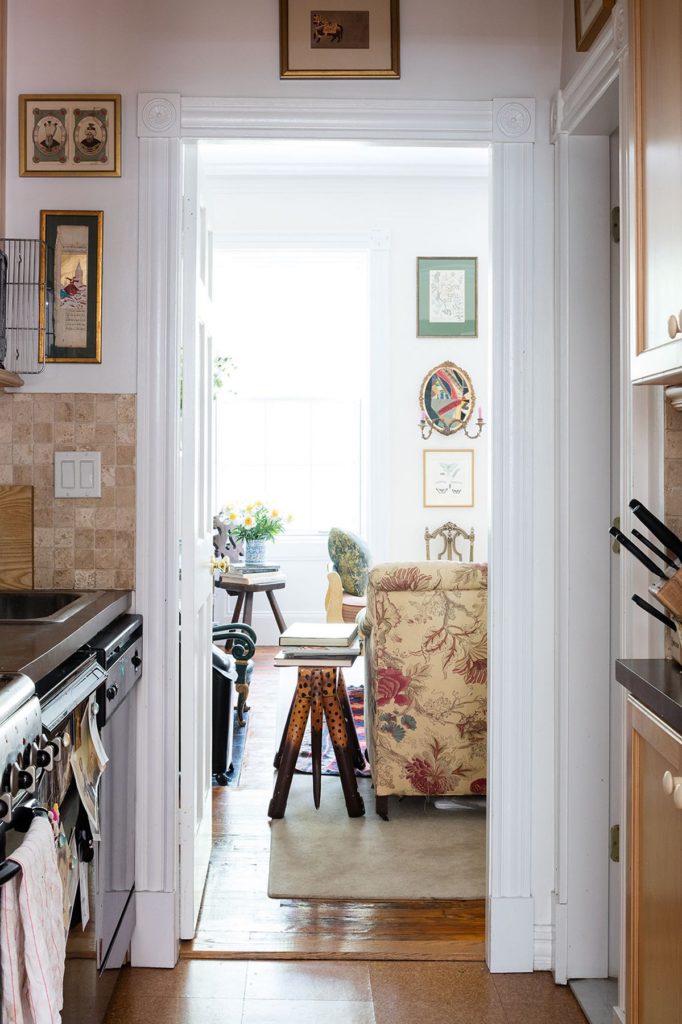
Vogue Living? This image represents most closely a space in which I would want to live. A space in which the dishtowels on the oven door handle play a visual role as do the frames on the wall. Celebrate the rumple, my friends.
Other sites host an aesthetic clearly not my own. BHG, I don’t know why but I don’t care for text-based decor.
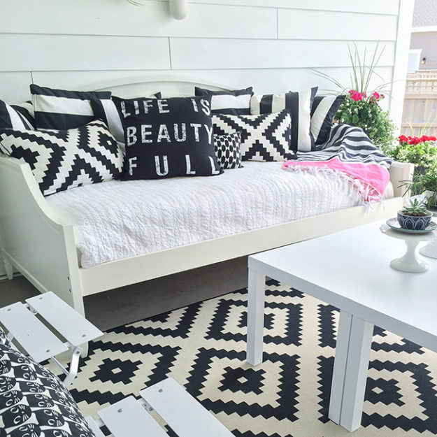
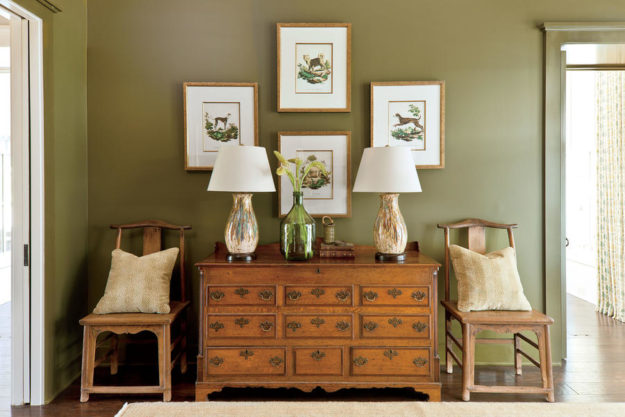
Southern Living, love the furniture, but what do you have against a nice pale blue, or navy, or, say, silver to add to this palette?
Beyond pure aesthetic then, the shelter magazines themselves are suffering from something of an identity crisis. Those who get the usefulness bit right, either in content (i.e. how to decorate with random non-beautiful art),
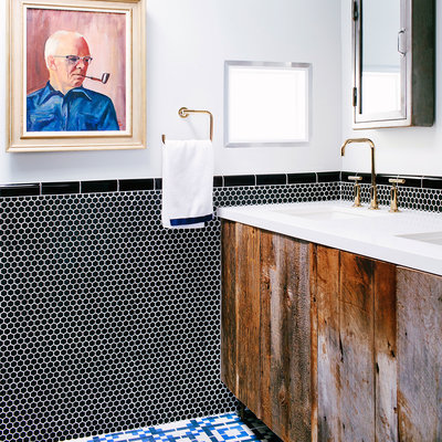
often seem to lack the resources for top-notch styling and photography.
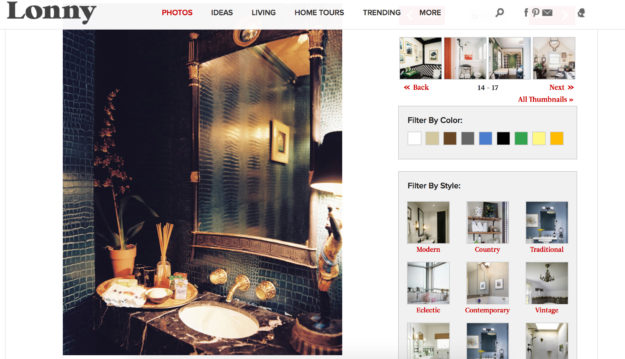
The perfect shelter magazine, for me, would have Vogue and Dwell’s aesthetics, combined, along with Sunset’s practical but creative thinking, and Lonny’s modern user experience and technologies.
In the interim, although I don’t do much on Instagram per se, I’ve begun to follow designers for inspiration. Bruce Shostak, Orlando Soria for sophisticated interiors, Christian Walker for architecture and design, Daniel Nolan (recommended by one of you) for gardens. And on HGTV I read articles by my friend Lauren.
You?
Ah well. Nobody ever said that finding oneself was easy. And nobody ever said these quizzes have to really be anything more than fun on a Wednesday morning.
Save
Save
Save
Save
Save
Save
Save
Save
Save
Save
Save
Save
Save
Save
Save
Save
Save
Save

55 Responses
I’m with you on the text-based decor, Lisa. I always feel as if I’m being yelled at from the wall, or pillow, or wherever it is.
Housetweaking is kind of a fun blog and I like some of the videos on Houzz. BTW, I loved your mother’s place. Perfection.
@Lauren Owen, Thanks.’ Mom’s house was really something. And I’ll check out Housetweaking and enjoy my mute decor;).
Agree on text decor. Makes me feel like I’m in a hospital room where they have a white board that says “today is…….” Presumably one does not need so much labeling to get through the day. Like Lauren, I don’t want to be yelled at by inanimate objects.
As for my style, cranky old lady with minimalist leanings living in an old Idaho farmhouse. Got a magazine for that????
@Mary anne, I suspect that magazine would sell very well.
I am with you on celebrating the rumple and not liking text based design. I could never abide a pillow telling me what to do.
@Kerry Steele, No pillow will be the boss of me, although they may try.
My magazine is real life. Flea market finds, (treasures!) curbside offerings such as a plain little rectangle table w/ shelf, painted muddy brown, that I repainted robin’s egg blue and then covered w/ battered old coins, foreign coins, squashed coins from those fun machines you handcrank…
A gorgeous Oriental black lacquer and burled wood 7 foot tall curio cabinet that someone didn’t want when they redecorated their whole home…
I have only one cushion w/ text–a chocolate brown rectangle with a quiet, cursive cream Cozy, that is perfect in what I what I already called my Cozy Corner…
My style is so eclectic I don’t know of a magazine for it, though I see occasional articles I click with.
@Lisa Chavez, I buy “Vintage Style” or “Flea Market Finds” when I’m at Home Depot. A lot of what I have is hand-me downs from various relatives or came off a local curb. I like seeing ideas for how to perk them up.
They can get a little cluttery so I interprete them with a light touch.
@Lisa Chavez, Sounds like you have a good enough sense of your aesthetic that you can go with the flow.
My sister got me my only text-based decor, a pillow that says “I smile because you’re my sister. I laugh because there’s nothing you can do about it.”
I keep it in the guest room, where she sleeps when she comes to visit.
I guess my style would be Coastal Living meets the Ikea catalog meets the Yankee Magazine Swoppers column.
@Patsy, Cue laughing ’til the tears stream down my face emojii.
Dissenter here — there is text-based decor I love to live with . . . .at the moment it’s packed, in storage, and I am feeling a bit as if my shelter magazine is an Etch-a-Sketch screen being turned over. . . .
@Frances/Materfamilias, People I greatly respect have text-based decor. I don’t shun it on principle, just need more quiet in my house than words allow me. I look forward to seeing what you do with your new place.
It’s even harder to care for text-based decor when it’s misspelled! And yet I think a lot of the text-based decor came from the old preppy needlepoint pillows you could get at Scully & Scully, along the lines of Wallis Simpson’s old saw, “You can’t be too rich or too thin”. Of course, those pillows were tongue in cheek, something which people nowadays don’t seem to realize, because all that text-based decor is so darn earnest.
If I had to pick a magazine, it would be the late great House & Garden — beautiful, comfortable, obsolete. When I have the chance, I pick up British Homes and Gardens, and (British) Country Homes & Interiors. I too love a cozy house that celebrates the rumple, and the English seem to do it well.
But for me, Instagram and a very few design blogs have taken the place of shelter magazines: Ben Pentreath’s blog and IG (and he has a new book coming out too), Ben’s husband Charlie McCormick’s IG (mostly flowers and gardens, lovely), Lauren’s Liess’s blog and IG (it helps that she is a serial house buyer and decorator), Schuyler Samperton’s IG, Anna Spiro’s IG, her mother Jane Spiro’s IG, Amanda C. Brooks’s IG.
@Rebecca, Ah thanks for the new IG resources. And I think you may be right, the text decor did start with needlepoint. All the way back to early samplers, mostly devotional I imagine. Interesting.
Sadly, it has been quite some time since I indulged in shelter magazines. I do love the image of the Vogue space which looks “livable” and yes, I too have kitchen towels hanging off the oven doors, for better or worse.
@Chronica Domus, You are another who has such a clear sense of style I imagine you just get inspiration from the world around you without needing more guidance.
I am comfortably beyond rumpled and firmly into chewed.
Ha! I love this response!
@Julie F, Me too.
Having spent 40 years acquiring things, now I will be spending the next 40 trying (unsuccessfully so far) to downsize it all. I think that puts me between cozy rumpled and minimalist.
@Jane, Squarely:).
I’m a disciple of celebrating the rumple, Lisa.
My shelter magazine is the annual Ikea catalogue. No domestic disorder situation ever seems to big for Ikea.
SSG xxx
@Sydney Shop Girl, I have to learn how to deal with IKEA. Maybe some day. It’s so dang big.
I like several shelter magazines. I like a “clean traditional” look and I like real color. My palette is shades of green, strong pink, violet, turquoise, creams – think of forest, oceans, and gardens.
Lately, I prefer The Cottage Journal and The Cottage Journal Coastal Cottages magazines. These aren’t overrun with advertising and the page texture is heavy and matte. A third one is Southern Cottage. Some of the most memorable houses I’ve seen have come from these three. It’s creativity without the crazy. Just beauty and comfort.
I used to love Coastal Living, but it’s all advertising now. I used to love Traditional Home, but it’s gotten snobby. Still like House Beautiful, but not the favorite. Veranda and Southern Accents when I can tolerate the sheer expense of the houses and focus on the ideas. So yeah, the three listed above are definitely my current favorites.
BTW, Lisa, why do you think that Southern Living room needs to have blue or navy in it?
@Anon, Thanks for the new site recommendations. Because, realistically, I’m going to read these online;). And I don’t think the SL room needs blue or navy in it per se, just that olive used to that extent becomes depressing, to me, and I want some variance in hue, preferably either complementary or neutral. I need what I look at to feel natural, and to me that photo tips over into the too intentional.
If that makes sense.
Yes, I prefer cleaner fresher greens as a background in paint and some upholstery. You can’t beat a green sofa for versatility.
And yes, there needs to be complimentary colors for sure.
I find something I like in almost every interiors blog or magazine. I do love that photo from Vogue that you have shared. i would add at least some of the photos from Veranda to your list.
@Susan D., I also like Veranda. And I love that you find so much you like. Speaks to your heart, I think.
I’ve replaced shelter magazines with a few design blogs and follow a few designers on Pinterest.
@mary, Care to name them?
I think that the combination of magasines,together with some real life inspiration works best for me (and for most of us,actually)
I like to look at,mostly scandinavian,minimalist (and even they are changing white and wood for a little colour) houses and decor,but when it comes to life actually,I am for the rumple and (my) personal touch.
I don’t follow designers on instagram , so your selection is very welcomed. Thank you :-)
Dottoressa
@dottoressa, That’s such an interesting thing – what we like to look at compared to how we like to live.
You are welcome.
I’m not convinced that I fall into the target audience for most of the shelter magazines, although I did enjoy the late House and Garden. I also enjoyed Traditional Home a bit the last couple of years, while I’ve sussed out some details on finding my own style, versus the “couple in mid-century modern house” style. But I’m often bored with TH, or any of the shelter magazines/sites. I think I am more eclectic and like a mix of modern and old, with a fair amount of snuggle and rumple. That is about as far as I can go with defining myself, as everything else seems to vary in my mind depending on details of place, light, and relationship and how they play into the mix. I do have one text-based pillow though, but I am considering recovering it.
@Mardel, Which brings up the question, who is the target market?
My mother saved Sunset Magazines for decades, carefully removing the ads so as to save space in the bookshelf (I found the deed to the house tucked into one of them – she didn’t believe in letting much go unhidden, and only filed the unimportant stuff in the file cabinets). I don’t think she ever read any of them more than once, but having grown up with them, I have a sof spot for that magazine. Among those you discuss, I too like Vogue Living best. For some reason, Architectural Digest has started sending copies to my daughter at my address, so every month I get to utter a few side-splitting “Ha!”s before tossing it out. I am at the point where comfort and color and ease of cleaning are paramount, so right now, paint is my best friend and I am currently engaged in DIY alteration of the hideous brown hollow-core doors I inherited into something less vile, with the help of a few lady bloggers who have gone before and kindly reported. I feel quite accomplished.
@marsha calhoun, I love this. All of it.
I feel so awful but I stopped reading magazines quite a while ago. Hmmm. Just WHY did I stop reading them? I’ll tell you.
I’m tired of vapid editorial. I’m exhausted of celebrities-as-models.
While photos are great and stunning, they do nothing to enhance my personal style and creativity.
I know. It’s me. But that’s my honest answer!
@Catherine, No reason to feel awful – the magazines are a product and when companies lose sight of customer wishes, and of the supply chain structure (i.e. the Internet and blogs and Instagrams) industries will change.
Just started with Architectural Digest. To educate my taste, as I am LOW wasp. It doesnt include anything I can do at home but at least I am not being told to decorate with sheets or use contact paper as some of the more accessible mags have told me to. And I didn’t know any better. I am trying to learn what quality looks like, as I was not exposed to it growing up.
Your blog helps in this arena!
@Caren, Thank you for reading! I would recommend that you also take a look at Reggie Darling’s old blog – particularly his house in Hudson New York. (It was in Arch Digest!) and then Bruce Shostak’s IG. Really old school, only the highest quality pieces, never ostentatious, etc.
LOL to being told to decorate with sheets!
My current shelter magazines consist of RV magazines, Family Motor Coaching and Motorhome. When one lives in 200 square feet, one glances at the magazines at the grocery check out while waiting. Other than that, they’re now irrelevant. I love that.
@Allison, Ha! OUTDOORS is your Interiors;).
I like contemporary homes. Glass doors leading to large patios and lawns looking to my manicured woodland. My home is designed to bring the outside in. Not a fan of text, as I have none in my decor. I like bamboo cabinetry and installed this throughout my kitchen and pantry.
@Susan, This sounds gorgeous. Manicured woodland isn’t doable in my neck of the, um, woods, but I love the look and feel.
@RoseAG Thank you! I live very near a Home Depot and will make a point of looking for those magazines. I agree; can get cluttery–so many treasures needing a good home or potential transformation projects. I try to maintain some balance on limitation…
Traditional Home was a favorite too. Used to enjoy (only) when on vacation – issues left by owner/renters.
@Meg, Old magazines. So evocative.
Personally, I am sick to death of white walls, minimalism and mid century. I see nothing in house decor magazines that I like.
My home is furnished with family furniture. Very little new. The only magazine I enjoy right now is the British Country Living. They have real articles you can read- not just photos – and beautiful gardens.
@Connie, I love white walls, but the midcentury business I prefer as part of an overall eclectic look. British interior magazines – I only know INTERIORS – may just be better than ours!
I drool over everything in Millieu Magazine. Before that it was Western Interiors. My husband and I are close to retirement and have decided to get the hell out of here. (Big City) We bought a lot in Sedona, AZ where we will put a contemporary,small modular home on it. Vistas,clean air,red rocks,small, artsy town. Doing it.
@MH Williams, Oh I LOVE some of the modular houses available now. BluHomes, for example. And a vista. Really, what else does one need?
I love shelter magazines but right now I’m a free agent playing the field so to speak. I became a bit bored with the perfect hedge fund Hampton/NYC houses that my former favorite Elle Decor continually covers. They are perfect but lack personality. Right now my most constant is The ‘World of Interiors’. But what shelter magazine am I? Like you a combination. Thanks for the post.
You may like my blog, it’s primadarling.com.
@Jolain Muller, I will take a look! Nice to meet you.
I used to buy shelter magazines in quantity. Then I remarried and moved to the country. The downside is big but I won’t discuss it here. The upside is natural beauty in abundance, constantly changing, every day. My interior requirement is now comfort, simplicity, sturdiness and natural materials.
Now I can hardly read a shelter magazine. I get occasional inspiration but most featured homes are so much for display and not for living that it makes me sad to read the articles.