(Late-breaking editorial correction! Monaco Blue is NOT the Color of the Year. It is a Top Color of Spring 2013! If you read the press release closely, you will see that correct terms were in fact used. In my hurry, I paid insufficient attention. While those of us who work primarily with words and numbers may not understand the fuss, I know that this is a key part of Pantone’s brand. Besides, the PR agent was very nice in her request for my attention. Another win for please and thank you.)
Good morning everyone!
Tuesday I washed my hair, donned the new Jigsaw top my sister gave me, packed a duffle with camera, tripod and umbrella against the threatening rain and left home just after sunrise. I’d sussed out a great brick wall as photo backdrop. The top is blue, the wall a turgid pinke-purple. Great planning, I thought. The best laid plans of mice and women. I got to the location, set up, took one photo, and that was it for my camera battery. No spare. Confirming that the best planning tool of all is a sense of humor.
We’ll get to the Jigsaw top next week. I’m sparing you all my attempts to find an alternative location for an iPhone shot in a mirror, as the only option was the ladies’ room at work, and I Just. Couldn’t.
So. I wanted to share with you one of the many press releases that come my way. This one addresses a trend we predicted. I’ve provided a little editorial commentary in italics, because, well, editorial defines the human condition, does it not?
PR Representative, New York, NY
Hello Ms. – I hope you are well! (for some reason pr agencies haven’t discovered mail merge.)
The wait is over – PANTONE has just announced its top color for spring 2013 is indeed a shade of blue: Monaco Blue. The shade is “not a bright cobalt or sapphire blue, Monaco Blue falls somewhere in between with a shot of sparkle.”
Pantone Color Institute executive director, Leatrice Eiseman, explains that the shade “speaks to the practicality that we are seeing in society. You have to realize there is still concern out there for the economy.” (i like that they include sparkle in practical. not sure how this relates to an economy, but in election years that’s how it goes.)
As you begin covering stories and writing articles featuring this year’s top color pick, (no plans to do so, but hey)I wanted to reach out with Monaco Blue product suggestions for every category of the modern woman’s life: Home and Bedding, Kitchen, Fashion, Accessories and Décor! (we will ponder this exclamation mark all day long.)
Please let me know if you might be interested in additional information, hi-res images, or pricing for any of these 2013 “Monaco Blue Products for Every Area of a Woman’s Life.” (no offer for a giveaway. drat. should i pursue? guys, you want some gear?)
Thanks in advance for your consideration! (you’re welcome. always say you’re welcome. the world needs all the civility it can get.)
Samantha
————-
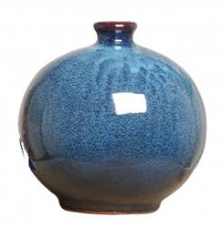
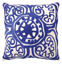
Altogether Home – Launched in August 2011, Altogether Home is a home furnishings and accessories retailer that helps people decorate with confidence. This interactive, online destination takes the guesswork out of creating a beautifully-coordinated room by providing world-class interior design inspiration, approachable and individualized design advice, and beautiful, high-quality home furnishings at real-world prices. The site’s first guest curator and product designer Marc Thee, is the founder of the #1 residential interior design firm in the country, and has more than 25 years old luxury design experience. Marc is available to comment on his thoughts regarding color trends and the selection of Monaco Blue as the Top Women’s Fashion Color for 2013. (nice work on the pillow, dude!)
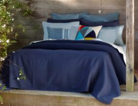
Coyuchi – The first company to bring 100% organic cotton bedding (oh good, i like organic) to the United States, Coyuchi was founded 20 years ago in Point Reyes Station, a small town on the Northern California coast. There, surrounded by ocean, forest, beach and bluff, Coyuchi’s “aesthetic ecosystem” philosophy of design was born, leading to a line of home textiles rooted in the innate qualities of nature. Coyuchi products are produced with natural fibers, free of the toxic dies, (is proof-reading a dyeing art?) bleaches and finishes used in conventional textiles. All Coyuchi cotton is 100% organic, produced using a nontoxic production process certified to the Global Organic Textile Standard (GOTS). Coyuchi can be found at fine retailers across the US and Canada, as well as available for purchase online at www.coyuchi.com
Zeroll’s Ussentials® collection is a line of 52 kitchen tools available in 9 vibrant colors. All tools are ergonomically designed for enhanced comfort and performance in the kitchen. From ladles to spaghetti servers to avocado slicers and more, Zeroll has a large variety of kitchen essentials in Pantone’s color of the year: Monaco Blue. (bringing new meaning to the term “everything but the kitchen sink.”)

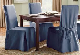
Sure Fit – Twill Supreme and Cotton Duck Slipcovers from Sure Fit in shades of Monaco Blue. These are available for dining room chairs, sofas, loveseats, chairs, recliners and ottomans throughout the home. (i have always liked the look of slip-covered dining room chairs. don’t know about blue though.)
Rowenta’s Delta Force Stick Vacuum (hahahahahaha. i did not see this coming. Steve Jobs, what have you done! color-styled vacuum cleaners?) Rowenta recently introduced three new colors into their premier line of floor care products. The 18V Delta Force Stick Vacuums (MSRP: $179.99) are both cordless and bagless, providing users with 45 min worth of smooth run time without the time consuming inconvenience of tripping over and untangling cords. The Delta Force has a 99% dust-pick up rate on hardwood floors, minimizing time spent on multiple clean-ups that is necessary with less efficient vacuums.

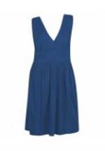
OneStopPlus.com – The world’s first online fashion mall for sizes 12W-44W. Choose from the largest selection of women’s plus size clothing, accessories, and lingerie. (always happy to find more plus size resources)
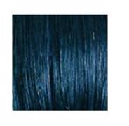
SHE by SO.CAP.USA’s Dark Blue hair extensions are a perfect way to keep up with latest Monaco Blue trend.
(don’t you want this woman’s job? kind of like, lorem ipsum dolor sit amet, consectetur adipiscing elit. sed at iaculis tellus oh and blue hair extensions. they must roll about the floor laughing. that said, she got me to print this press release. so.)
With over 90 different colors, SHE by SO.CAP.USA offers both clip-in and bonded hair extensions, clip-in fringe bang extensions and clip-in ponytail extensions. Readers can be directed to either the SHE by SO.CAP.USA website or call 877-855-4247 to find a participating salon.
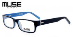
GlassesUSA.com: GlassesUSA.com’s Muse sunglasses are a great way to keep up with the latest Pantone 2013 trend of Monaco Blue. A nice combination of acetate and metal material, black and electric blue colorings throughout, these trendy sunglasses are sold at an affordable price of $119.00. Another great way to keep up with the latest Monaco Blue trend is with GlassesUSA.com’s Muse prescription sunglasses. With a sleek navy blue exterior and clear blue interior, thick high-grade acetate base, and retro frame shape, these chic yet sophisticated glasses are sold for $89.00 and can be purchased on the GlassesUSA.com website (www.GlassesUSA.com).
(i’ve stopped laughing. i just bought blue reading glasses at Whole Foods for $20. oops)
White Cloud Electronic Cigarettes: In making sure that all accessories are on trend for spring 2013, White Cloud Electronic Cigarettes’ vapor jackets come in a pantone blue set.
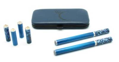
(adhering to the timeless and valuable admonition, “Always Close With A Bang!”)
Enjoy Thursday. May your plans go smoothly, and your batteries hold their charge.
35 Responses
Thoroughly enjoyed the commentary!!! This post is one of the funniest one I have read. Spot on.
This new blue reflects “there is still concern out there for the economy”? I wonder if it’s the same shade of the ties the President has been wearing in the debates.
The photos aren’t showing up?
Me too. No photos.
I finally fixed the problem. Had to load the photos myself.
“…speaks to the practicality we are seeing in society.” Wow, there’s clunky for you.
V.entertaining, thank you ,Lisa!
i have always liked the look of slip-covered dining room chairs. don’t know about blue though.)
Regarding blue and food. As a former chef, blue and food are not a good mix. I think that blue in a dining room is elegant in theory, however, in reality, blue just sucks all the life out of food (unless it’s blueberries and they are right next to a bunch of strawberries). When I see blue-themed dinings rooms my heart sinks. This even applies to blue willow plates, which I personally adore. Unfortunately, food on those plates doesn’t work if you are concerned with presentation. I think you can have the most elegant blue dining room imaginable but the food itself will not present well. I know people will disagree with me, but food doesn’t present well juxaposed with “cool” colors.
that’s really interesting. several years ago in a nutrition course i took, we had a discussion of color and food. one of the suggested weight loss tips was to eat off of blue plates – they said it makes one want to eat less, whereas red increases appetite (one of the reasons fast food places are heavy on the red decor).
I’m a painter and work at a studio with a bunch of other artists. Years ago we had a long talk about blue food, and decided to have a pot luck with everyone bringing blue food – mashed potatoes with blue food coloring etc. No one could eat. I do think that blue and white plates can work, but the walls need to be coral, or a wonderful yellow or something to counteract the “blue effect”.
I have cobalt blue Fiesta, and love it, but mix it in with other colours: grey, pink, dark red. But then Le Duc is such a great cook no one really notices if the colour is not suitable for food.
What fantastic information. Thank you for sharing it here. Who knew?
i love your commentary, thank you for the laugh. in the earliest days of my former career as a publicist, a mail merge was one of the first things i learned how to do!
btw, the photos aren’t loading. is it me?
And may I say good riddance to orange.
And may I sit by you!
With company:).
Too bad your original post plan did not work out.
Unfortunately I managed to see all the pictures ; ) too.
Can’t see the images, but I’m relieved to know which colored items to purchase. I’ve been worried.
The pictures are not showing.I will skip the blue trend.Ida
Such hilarious commentary on this post – and what IS the deal with no mail merge on so many PR emails? Sad pandas to be sure! Did you know the #2 Pantone color for Spring 2013 is DUSK blue? Woohoo! Shades of difference from Monaco but distinct enough to earn it’s own slot.
Thanks to Jackie Kennedy’s refurbishing of the White House, I grew up in a home with a powder blue palette. I love most hues of blue and when I get to see the Pantone color swatch of Monaco blue, I will no doubt fall in love with it. However, the blue food repulsion is very real…I threw away a bag of M&M remnants yesterday….all that disgusting shade of neon blue: terrific for windshield wiper fluid/bad for substances humans might ingest.
Blue M&Ms! A horror of the modern age.
Even though the photos aren’t showing up I have a very clear idea of the many places I can go to see this new and politically correct color.
That wasn’t you in the ladies on Instagram?
Where were you? must put on reading glasses.
xo J.
That was me. But I refrained from sharing photos of myself in a ladies room here on the blog. One has one’s standards, after all.
Since we are now in the season where I am working with ladies who know such things, I appreciate the information. You can bet it will be put to good use.
Wait. Season? What season:).
That is a great celebrity baby name! Monaco Blue Jolie-Pitt!
I’ve always worn blue, and like some blue in my home, and pay little attention to the color that’s “in”. I know wine/burgundy/oxblood is the color for Autumn, but I don’t have anything in that color (except for cordovan penny loafers) because I don’t really like it on me. Monaco Blue is a nice name, in paint it’s very close to Prussian Blue, which I love.
I loved your commentary. My husband asked what on earth I was snorting about. I am highly amused that the good people at Pantone think that as a modern woman my life is encompassed by the categories of home and bedding, fashion, accessories and decor!.
I kept debating whether or not this level of snark was OK – but a) supposedly the only bad publicity is no publicity and b) mild poking of fun has got to be OK.
lisa i admire you for scouting out locations for your fashion shoots. i’ve someone that continually berates me for always “posing” in my driveway. in fact he/she tells me it’s a driveway not a runway.
actually i think i like runway better.
i love blue and have some far off plans to do up the house in the spring with blue accessories. i already have them so why not? and jack white is ahead of the curve again with his blunderbuss blue tour.
xoxo
janet
Much like Kathy commented above, “I’ve always worn blue, and like some blue in my home, and pay little attention to the color that’s ‘in’.” Even when I was planning a wedding, I didn’t much care to know which colors were popular (except to hope that mine were not, in hopes of maybe getting a discount), so I’m a bit confused by the fact that there are entire press releases about things of that sort. Regardless, Lisa, your commentary made me laugh the whole way through, and I didn’t even ask myself, “Am I really reading a press release about a color?” once!
Also, I think it’s funny to see that the color my best friend calls “Kyla blue” is on trend! The eyeglasses that I’ve worn for years are actually (now I know!) Monaco blue with a dusk blue interior. They match my favorite t-shirt. Oh, how exciting–I will finally be trendy!
Happens to all of us at one point:).
Ha! Loved it (particularly the ipsem lorus bit).
What it says to me is ‘massively out of touch’. Who on earth has enough money and as little sense to think ‘ooh, they’ve said this is the colour this season, I’m going to change everything in my house to that colour!’
Blue kitchen implements?! If I liked them and needed them I’d buy them, but I wouldn’t change them ’till they wore out.
I was wondering if you ever thought of changing the layout of your website?
Its very well written; I love what youve got to say. But maybe you could a little more in the way of content so
people could connect with it better. Youve got an awful lot of text
for only having one or 2 images. Maybe you could space it
out better?