You all have been so great talking to me about my house design project. I felt a little bad that my response has often been, “Great idea, but probably not my taste.” Then, almost like the iconic slap upside the head, I realized I hadn’t ever made my taste clear. At least not in houses. Tsk, tsk, Sturdy Gal.
In part, as we’ve discussed, that’s because my house aesthetic is even more freighted with cultural and class references than my wardrobe. I can articulate the High WASP Style Archetypes because they have developed in response to an audience, a social context. Houses? Well, as I’ve said, houses are private. Words hard to come by, in description.
So we move on to photos. Fortunately, in 2014, not hard to find. But there are so many pretty pictures, and so few in which I would want to live. Is it common to find photos that you want to move into? It was possible in fashion. Or perhaps after so many years of scanning fashion mags I’d learned to see the real outfit behind the style photos.
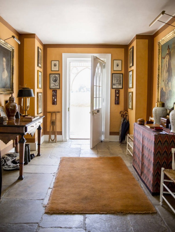
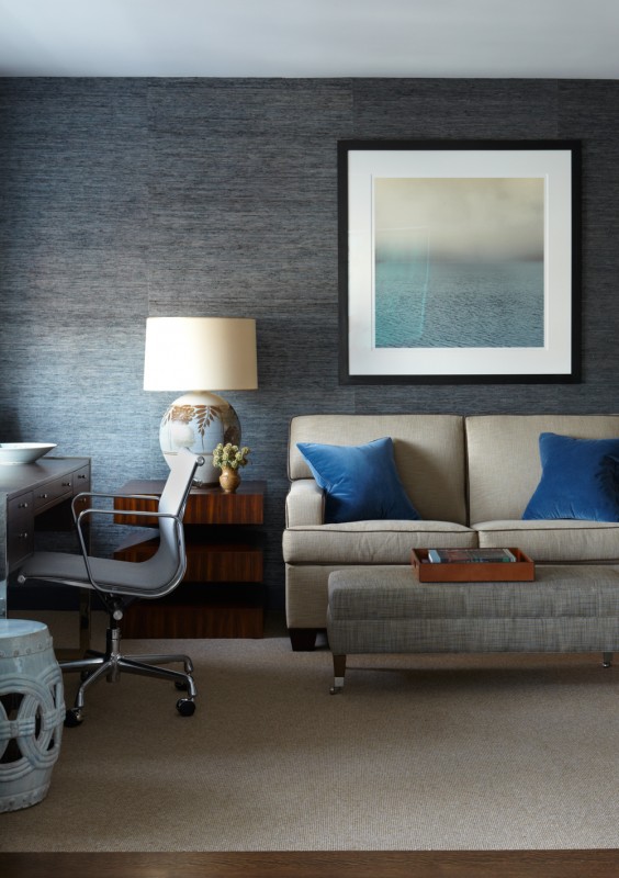
In any case, behold 7 interior shots I could actually inhabit. Most culled from my Pinterest feed, so not new to all of you. However, let us run the images through our fingers like wheat and see what remains. Sometimes the chaff is what you want.
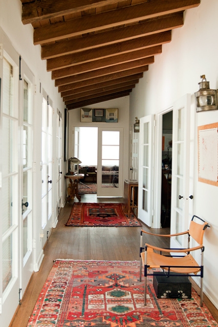
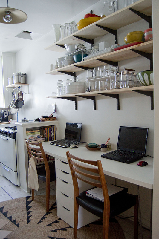
Practical. Objects of work presented as they are. White surfaces, simple wall shelving, subtle mid-century chairs, industrial light fixture, and yet more natural fibers on the floor. From Heart of Light, a blogger who writes about food, design, life, and who really lives in that photo.
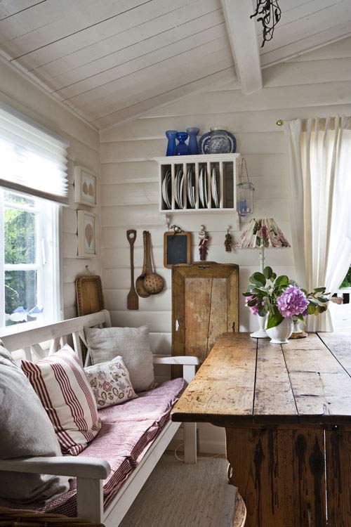
A place in the country, the nook an homage to breakfasts. Here, I’d have to change out that lampshade unless it came from Aunt Priscilla in which case it’s staying forever.
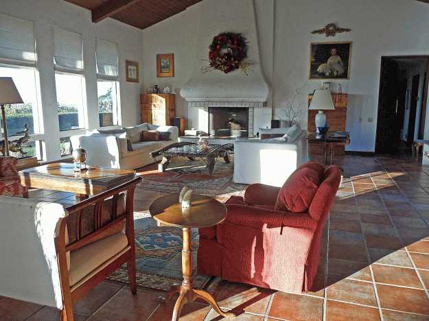
And then of course the Platonic ideal, Mom’s living room in Santa Barbara. Or Dad’s dining room, for that matter.
Not that I really want swords, I don’t. They come with the territory. So, yes, I cheated and chose 8, but we’ll combine the parental spaces into one ür-home of the heart, shall we?
What over-arching principles to infer? I find these.
- A love of natural materials.
- Surfaces that can sustain the stuff of living, and much of that stuff already in view, but ordered.
- No “named” style, but not quite what they call “eclectic” these days. A mix of the modern and the classic, but a touch rustic.
- Serene but warm.
- Colors but layered in tones, rather than contrast and “pops.”
- Histories of many decades.
- Little pretense, not affected, not formal, not twee.
- Many references to the houses of my family, even now.
You who are so much more deeply educated in this process, you may deconstruct those photos and find yet more principles and guidance. Tell me how to describe my taste. I am so curious.
Photo credits:
Traditional Basement by Barrie Interior Designers & Decorators Staples Design Group via Houzz
Joan & Jim’s Lovely, Artful Home (Santa Barbara) via Apartment Therapy
India Hicks and “The Grove” via Domino
Home Office by Bruce Shostak via Shostak & Company
Workspace via Heart of Light
Origin unknown via Pinterest and Fagin’s Daughter Tumblr

65 Responses
I hate to dust so no open shelves in the kitchen, please. I want everything behind closed doors. I have this fabulous wall unit in my living room with six cabinets with doors. LOVE IT for hiding stuff.
Ah, I rather like dusting!
I have a love of white walls and plain floors, whether they be wood, carpeted or tiled, letting the furniture – sturdy and nothing too fancy – drapes and decor “make” a space. Needless to say, I adore your mother’s living room.
I also wanted to say something about the kitchen photo, but I’ve been pondering a post of my own about kitchen decor (yes, you can pick your jaw up off the floor), so I’ll leave it for that.
Speaking of jaws and floors, there’s a fashion-related post up today.
Can’t wait to see your ideas on kitchens. I imagine an entire series of posts.
Your mom’s living room is my favorite of the rooms, and probably the only one that I could live in comfortably. I going to stick by what I said at the beginning of your project – pick a bedroom rug (preferably something Oriental like your mom’s) and go from there. If you have a great rug, even if you move, it’ll work somewhere – it always does. You could do your headboard in a vintage looking leather, which is comfortable and practical. The problem with a fabric like linen, is that they stain where a head is placed, night after night of reading or whatever in bed.
And leather headboards are easily found these days, Restoration, Pottery Barn, Crate and Barrel, Room and Board – no need to go custom.
So here’s the thing. Oriental rugs feel too public to me? Too, um, masculine? Not fluffy enough for a bedroom? I had my one good rug, a large oriental that I bought in Brooklyn 35 years ago, in my bedroom for years. Now I find I want something just a little more, um, accessible. I put the rug in the living room/dining area/kitchen. Does that make sense? Too intellectual? Hence the Feizy and or this one from Garnet Hill? http://www.garnethill.com/moroccan-star-hand-knotted-rug/363288
I sort of feel the opposite about it all. But when I did a lot of interior design I always felt a master bedroom should be very gender specific to be sort of intimate and sexy. Could be masculine or feminine but not in between, like other rooms, except perhaps libraries, which I always felt should be masculine. Maybe old school thinking?
Huh. Interesting. I find myself quite clearly wanting to mix conventionally masculine with conventionally feminine – pink toile and gray fabric headboards, for example. Not that I’ll do it, but I find myself considering it.
I noticed a great deal of white walls and surfaces made warm with warm woods and natural fibers. Lots of good rugs too. Stick to those for the foundation and add in personal bits and pieces of any type and you can’t really go wrong.
@Kerry Steele, Thank you.
@Kerry Steele, I noticed that, too. The foundation colors are definitely white with that warm/medium wood brown. Everything else should probably be built off of that foundation.
Will do:).
I could definitely live in #2. I love all that light, the white, the wood…
@Buckeroomama, Sigh:).
I agree about the rug, an oriental rug would really be something to build from. Seems to be a touch “empire” style. Waspy and worldly both.
@Gina, Interesting. Empire style. Now that’s something to think about. The most visible impact of privilege, then, being world travel. And maybe the generations of travel too.
Well, British empire, or British Colonial, but toned down and clean.
http://www.houzz.com/British-Colonial
Like the British empire gave up on world domination and moved to California. Quite apt. I’m a little aghast at the remnants of colonial oppression, but I guess not wholly surprised.
I totally love this idea and I may copy it! You learn so much about someone when you view the spaces they would choose to inhabit (were time, money and effort no object).
It’s all yours. Can’t imagine it’s a new idea:). What did you learn, if I might ask? I think I’m trying to learn myself!
Very beautiful, very British in many ways, I pin a lot of lovely interiors but wouldn’t actually want to live in any of them. I like to live in a cosy, decrepit, comfortable house.
That’s quite reassuring. Cosy and comfort are paramount to me – California hasn’t been around enough for any good decrepitude:).
It seems you like what is referred to as modern traditional. But this is the most livable IMHO – what is too editorial doesn’t suit every day living. What I want to see in a magazine and in a boutique hotel that one stays at for two nights is completely different from what one wants day to day. I like the mix of textures and fabrics.
Good point. When I chose all my Pottery Barn stuff after the divorce I remember thinking that I just wanted the apartment I moved into to look like a pretty good hotel. I no longer feel that way.
Wow! I actually like all of these. Clean, crisp and simple. I would probably have to edit a little (I tend toward the minimalist), but these rooms are places I could jump into.
Well hey!
Take a look at Thomas O’Brien’s work for the look of clean simplicity and yet depth and texture
Thank you. I really appreciate the additional resources.
I’ve been thinking about this on and off since I read it this morning. Surprised, a bit, to see how much overlap there is between yours and mine, and interested to see where the differences exist — some of them, I think, a response to place. And I probably tolerate more stuff? (I hope not clutter, but I’m def. not a minimalist). I’ve rarely/never taken time to deliberate much/enough, and I am pleased in many ways with the organic ways that my style has manifested itself in my home. At the same time, sometimes I see through an imagined other’s eyes, and I want to do a reboot! And the reboots might come out much closer to the images you’ve assembled here — except then I’d start living in them and . . .
Muddy, rambling, I know, but I’ve finally got my place back to myself after 10 days of houseguests, including 2 little ones. . . .now I’m looking at it through your lens. Thank you . . . . (and, you know, come and compare any time. . . ;-)
I think I’m wanting it to look organic, but with less clutter than would develop in a true organic process. I am so glad you have your place back, although I know the guests are beloved, and I am determined to visit some time in this decade:).
Looks like a nice place to hang around, maybe have a drink, enjoy the view in open urban-cottage style. Despite the big breakfast table something about the kitchen suggests that we’ll be going out for dinner.
My actual kitchen probably makes it quite clear that I cook a lot. Big Thermador range, butcher block island, completely plain white cabinets and black granite counter. Utilitarian and simple. And in fact Rachel at Heart of Light is a great cook, and meal planner too (http://heart-of-light.blogspot.com/2014/08/on-homefront.html) We all make do with what we have, if we’re lucky.
With no training whatsoever in interior design here is my reaction. All the spaces you show are lovely. As far as I can tell, they have nothing to do with your space which is mid-century modern. Please forgive me if I’m wrong. Mid-century is lovely, too, but if you take the same rug, furnishings, accessories and put them in your space and in the spaces you show in the photos, they look completely different. I think.
I am enjoying your decorating posts very much.
Well, yes, the house was built in 1953. But the way it actually looks is generic California ranch, if such a thing can be said to be ahistorical. And we remodeled back in 1992, opening up the kitchen to the dining/living area, turning one bedroom into a study with sliding doors that opens into that same living area, adding a back hall with slate flooring and lots of windows, as well as the entire master bedroom/bathroom area. And redid all the bathrooms – unfortunately 1 of them in a large square gray tile I really don’t like:(. So, in any case, the house is now 20th century California, broadly, as is almost all the neighborhood in which I live. I’m going to do a post on my front door, which I think is original, and a good example of mid-century modern in the Pretend Medieval Doorknob and Doorplace mode.
Thanks – this gives me a much better sense of your space. When I think about decorating, in my untutored way, it seems to me there is the exterior house design, the interior house design (which doesn’t necessarily match the exterior) the style (or anti-style) of the furnishings, and the style of the landscaping. Can any of those components exists without relation to the others?
What I find most pleasing is when all of it sort of flows from the personal style of the owner. For example, Vanessa Bell’s Charleston. I find it a perfect space, in its context. However, if a non-artist copied it too closely it does become “twee” in my mind.
The whole subject is fascinating to me and I look forward to reading and seeing what you do with your present space, and perhaps your new space if you make your move in the near future.
I am so glad you enjoy these posts, it is a great kindness you all do in supporting my large focus now. And I agree, all components co-exist. The grand unification is perhaps what I’m exploring.
When I did some major house work a few years ago, I read a lot of books. One of them was a guided process for finding what you liked called What Color is Your Slipcover? It was a big help, much better that the title, and I think you might like the writer’s approach.
I will give it a read. Thanks!
You certainly like white , which in the warm light of California must work well . Here in the UK with our cool northern light , not so good – like a dentists waiting room . Personally I don’t like everything to be too spic & span . I like the little shabbiness of things well loved and not too much importance given to the latest & newest . Ive heard it called shabby chic but I’m not sure I manage the ‘chic’ . Your mothers room is really lovely & I wonder was it designed or did it develop gradually ?
I’m with you – I like a little fray, or at least texture, in everything. Mom worked with a Santa Barbara decorator to find her large sofas and central coffee table, and to replace the tile/carpet flooring with the large terracotta ones you see, but I believe she had everything else already when she moved from Sweden. The tansu along the back wall, for example, she bought when she and my father first separated. The sofa table is actually mine, from my father, on loan to my mother:). The art was acquired anywhere between 1967 and 2010, the grandfather clock is from her family. And so it goes.
I’m so glad to find your blog and our tastes are so akin! I love the images and bullet points you chose and feel the exact same way! Love your header and how neat and sleek your blog is. I will be following! xo Nancy
Welcome! I’ll wander on over to your blog.
This is probably not very helpful, but somehow your sense of style–particularly your favored color palette (cool, watery blues, dusky lavenders, serene grays, and a hint of warmth via, say, a pale buttery yellow)–reminds me of two art exhibits I saw in the 1980s, one of which, Northern Light, featured Scandinavian painters of the late 19th/early 20th centuries, and the other of which displayed Scandinavian waterscapes/skyscapes/landscapes. The wood floors, white walls, clean lines and lack of fussiness, tempered with a hint of weathering and rusticity, as well as a certain coziness, also read Scandinavian (not really Gustavian, but certainly not overly-modern/IKEA). Maybe your style is Scandinavian Sturdy…
Ha! I certainly love the Scandinavian styles I see when I visit Sweden. And the northern maritime is a landscape of almost hallucinatory beauty. There is something astringent, but not bitter, that appeals.
If your flooring is wood and dark I’d go with several soft fluffy sheepsking rigs beside the bed and perhaps a statement rug elsewhere in the room if you have the space…
I like a mix of textures over colours…linen sheets and a duvet would be a priority if I was redoing the bedroom. Rough Linen online is worth a visit.
Old woods with patina and distressed leather can look fabulous in a muted white or creamy room…like others have mentioned i like how your mother has decorated her Santa Barbara abode.
The flooring is wood, but quite warm and yellow. But statement rug, that’s soft to the toes, hoorya! And I’d love to have the Rough Linen stuff as bedding, depending on how the color of everything else works out.
Gee whiz…sheepskin rugs!
Organic doesn’t have to equal cluttered. We combined 2 existing households when we married and have acquired more when our parents downsized. Some things go on vacation in the closet for a bit, while others take their places.
I’d like organic without clutter, I think that’s what a thoughtful visual life is. For me.
I’ve had a sheepskin rug in our master bedroom for a few years. We live on a mountain covered in rustic detritus and the room is beautiful if a bit “raw” at times. the sheepskin has an amazing texture
I do tend associate sheepskin with mountains!
I think that our home is, or can be, an even greater expression of ourselves than our wardrobe. Taste is really individual, but when I think of the homes of others which most resonate with me, they are those in which the home reflects the personal story of the people who live there. I am so much less impressed with the perfect accessory than I am with the thing which tells a little bit of you, and your family’s, story. Styles come and go, as do colors, but your story evolves, and if your choices are true to your story, then it will be lovely. (So keep the swords!)
That being said, I became one of those who make up the trite story of having to declutter their house to put it on the market for sale, and it is a surprising exercise. Without losing anything of significance, but removing most of the inconsequential contents, everything looked so much better. So my only advice is that before you do anything of signifigance, pretend you are moving and styling your home as if it were for sale, and wait for the revelation. It will probably be much clearer what you need to do to have the home you want to have.
My brother has spoken for the swords:). But I agree, I have no intention of any sort of wholesale sweep. I already made one in the divorce, to an extent, except for the kids’ stuff. And the sense of clarity post-junk has been wonderful.
The country nook is calling to me – warm chats around the table, reading a classic on a rainy day with a warm cup of tea, family and friends to share a meal or celebration. Beautiful, warm and inviting!
I imagine you and chatting:).
Everyone is a winner. I could curl up in every chair and find contentment. Love the ancestral painting. Gotta have one of those. :)
I have a photo framed of my father’s mother at 2 ages. It serves the purpose:).
I was going to jump in to say look at Thomas O’Brian, but someone beat me to it. You will find much to like in his book, American-Modern- or Aero,his shop in NYC(online too). There is a young designer, Lauren Liess, who has a blog Pure Style Home, that has a modern, organic feel and Gil Shaefer is an architect that has a book, The Great American House, that will call to your crisp, classic, patrician side.
I like you style very much and would say we are trying for a similar, undone, but comfortably elegant style, a little spare and with deep connection to family, history and nature. Lots of warm wood, antiques with clean lines, modern with clean lines, everything comfortable, a feeling of embrace, no raised voices(no pops of color/accents) but smart discussions( quietly assertive accents- usually with family/life history). I once described our house as California casual, by way of France, rooted in Virginia horse county and going minimalist. It isn’t a style for the magazines, but a description of our lives’ peregrinations…
“a feeling of embrace, no raised voices(no pops of color/accents) but smart discussions( quietly assertive accents- usually with family/life history).” Love this. And Liess was suggested to me on Twitter. No I’ll go look up Mr. Shaefer. Thank you so much for chiming in. And Aero, sigh. Maybe I can be happy with just one of his baskets.
I’m one of those people who has pinned and saved tons of photos of things I like individual bits of but which in which I could not tolerate living. Your refreshing post is causing me to rethink. I like your color palette. I actually think I like some of your choices, one and two especially, and of course your mother’s living room, which I saved to my computer but did not pin (correcting that now), which I too see as a kind of platonic ideal. I have a lot of trouble with rooms I could live in, and have been much better at “rooms I can tolerate as long as I ignore things”. Decorating is hard, or so it seems to me.
The India Hicks room is beautiful if I lived in a tropical space, but too cluttered for me, it would drive me batty. I love the color and texture of the Bruce Shostak room, but it is too minimal. Love the whites, and the practicality of the desk in one photo and the rough table in the other, but again I have clutter issues, although I love to dust, mostly because I love to touch meaningful objects, by which I mean even simple things that are useful and meaningful to me.
Your post is making me think again about space and the very personal ways in which we interact with it. Who knows if this will go anywhere. On the other hand, I just ordered from the Rough Linen website, thinking it might actually meet my impossible demands for simplicity, beauty, and authenticity of materials. Or perhaps I am hoping for too much.
Lisa,
I am beyond pleased to find a comment from you. I enjoy your postings so very much, pulling me in directions I haven’t quite thought about deeply or clearly. The house/shelter/dwelling is something I’ve needed fix in my life, over and over as we have moved-and evolved- and have thought about, dissected and enjoyed finding a peace with home as biography rather than what is “in style”. I am so happy for you and enjoy every single post. It was a pleasure to have something to add to the discussion, rather than only soak up your thoughts. Best and writes regards, LA
Writes regards works too:). I appreciate all kinds of serendipity. Thank you so much for reading.
*warmest regards
Lovely stuff! Thanks for sharing your thought processes and letting us live vicariously through your decorating. I’m barely in a position to buy a piece of furniture (small furnished flat) so the dream of a whole house and musing over what should go where is out of reach for now, but hey… there is a season for everything…