Contrary to what you might with reason assume, this is not a post about why my heads looks so big, nor on how I need a haircut to prevent the dreaded Pinhead Ponytail, nor, (but thanks for asking) am I updating you on my tendonitis and arm brace. No my friends, this is another panegyric to the joy of layered neutrals.

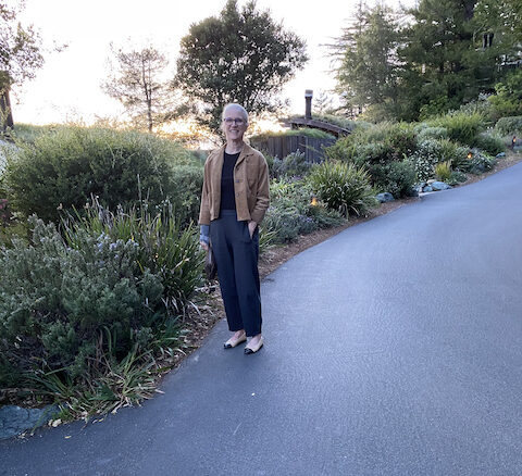
I’m wearing a tan corduroy jacket from Société Anonyme (brand. I love the spot-print t-shirt dress), a black ribbed UNIQLO tee, Eileen Fisher lantern pants (not the cropped ones) in Graphite, and Chanel captoe ballerinas (pre-owned).
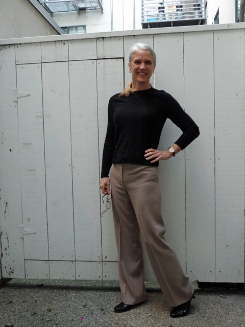
Below, some outfits you’ve seen before. 2011. That’s over a decade past, my friends.
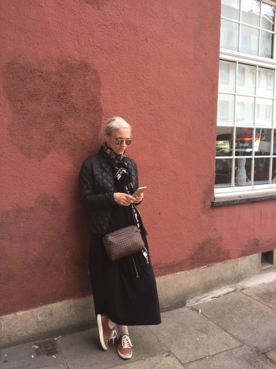
2016

Why such fondness for shades of brown and black? Maybe it’s because my coloring straddles cool and warm tones. I do best in “neutral” shades of lipstick, AKA Could Go Either Way. Or maybe it’s a certain hypersensitivity to color stimuli. Your guess is as good as mine.
Posting these old photos reminds me how heartening is a blog. (Maybe Instagram is the same for active users?) It’s nice to have a record of moments when I enjoyed my look. Two years largely inside, augmented by a congenital love of comfort, has left me with many memories of Sweatpants Lisa. It’s nice to gussy up.
Have a wonderful weekend, and do your stretches.
Some links may generate (infantesimal) commissions


16 Responses
And it’s nice to see you gussied up, as well. You look great.
Thank you!
I trust you and your overworked wrist are doing well, gussied up or not. I am writing here just about the picture from 2016 – taken on a trip with your son in the British Isles, I think?.
Well, wherever, it is an excellent picture, just as a picture – the relationships between and among the colors and lines, and your own placement therein, are quite remarkable. Did the aforementioned son take this picture? It does reflect an artist’s eye…
Yes, my son:). Might be my favorite picture of me ever. xoxox
I think I have a hypersensitivity to color stimuli, as well (as reflected by my usual clothing choices). My coloring is quite warm, but I never like the way I look in colors as much as neutrals. Any shade of brown with black and/or navy is always a good bet. :) You look lovely. Wishing you continued healing and a weekend full of joy!
Thank you:)
I so look forward to sitting down and reading your blogs, even though I find I may need to look up a few words here and there . Agree with you about the neutral colors, and usually they all go together.
I learned “panegyric” from my dad. First time I heard him use it I was in my 50s or 60s, so I’d have to look it up too;). Thank you for your kind words.
Ma che bella! Just home from Italian class and I turn immediately to see what you’ve posted. . .
Con un sorriso.
xoxo,
f
Thank you!
Love that photo your son took! I wear neutrals generally too. Besides black and brown, I add navy, gray, and army green into the mix – it all works well together.
Color can be emotionally draining for me….
Army green is such a good one.
To KSL from Victoire:
Your comments here on “neutrals” and “color” are surprising, because you use color so vibrantly and inventively – even transportingly – in your art. Which is part of why I love your work!
You always look great–and I agree it is good to look back at older photos. And yes, two years mostly indoors has taken a toll on my wardrobe. Everything seems terribly dated and I seem to have nothing to wear!
Thank you! I send you best wishes for the process of finding something to wear. It’s tricky:)
To Victoire from KSL,
Yes, I was going to mention that actually. I love working and painting with strong color, and maybe that’s why I find wearing it draining? However, I do wear strong colors in the summer.