You guys up for another game of Give Lisa Your Opinions On Color? It was so much fun with the front door, let’s play for my “studio!”
Yes, as part of my house interior update, my son’s room is becoming a “studio.” I use the quotation marks because I have not yet earned the right to use that term in its full sense. “Office,” on the other hand, feels a little “off.” (Sorry.) I may eventually settle on “workroom,” but I’ll see how the space evolves before deciding.
This is how the room looked, before.
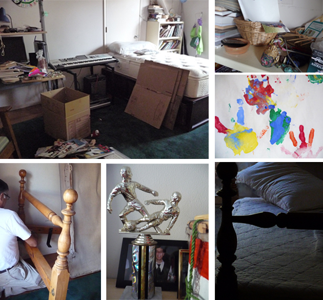
The rug, a soft forest green carpet remnant, for floor play. Daybed, thrown in a Christmas ago, to house guests. Carved wooden four-poster, where my son slept for years, from my grandmother’s house. One of my cousins must own its twin; my mother and her siblings were more focused on fairness than integrated furniture futures.
And here’s the room as of April, 2015.
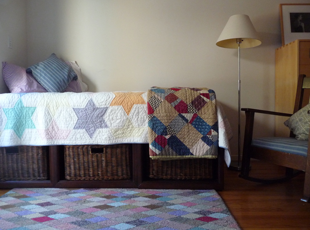
Here’s what you see.
- Pottery Barn daybed, here
- Dash & Albert “Harlequin” rug
- A very old quilt from Garnet Hill that used to live on my daughter’s bed
- Another, antique, quilt one of my best college friends gave me for my first wedding. Not sure if it works here, but am enjoying the experiment.
- A 35-year old lamp from George Kovacs’ now-closed Manhattan store
- Mission rocking chair I bought from an East Bay antique store when I was in high school
- Pottery Barn cushion (current offerings)
- The corner of an old Ikea chest of drawers
Eclectic, as one does at 58.
I like to sit in the rocker and stare out the window. The bed will house guests when I’m lucky enough to have any.
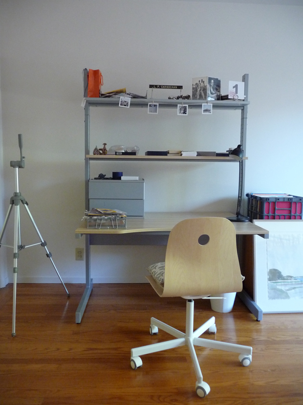
Here’s what you see when you enter the room. If you’re visualizing as you read, this area sits at kitty corners to the daybed. I’m keeping my son’s old Ikea desk, and I bought an Ikea chair recently, to match. Essentially, I’ve split the space, the area by the window is cozy, colorful, and berugged, the area by the desk wood-floored, neutral, and practical.
As always, I’m using feng shui principles as a starting point for the fixup. As always, because why not? Without constraints, a few limits on my choices, I’d never do anything.
What does feng shui indicate for this area of the bagua?
- It’s the space of children & creativity
- Use white, pastel colors
- Fill with stuff that supports and inspires the tasks at hand
Creativity, well that’s a lucky break. Pastels, you see in evidence. (I absolutely love the rug, thanks Mom!) Task support, I’ll organize. But what I’m enjoying almost most of all is hanging creative work by friends and family, as inspiration.
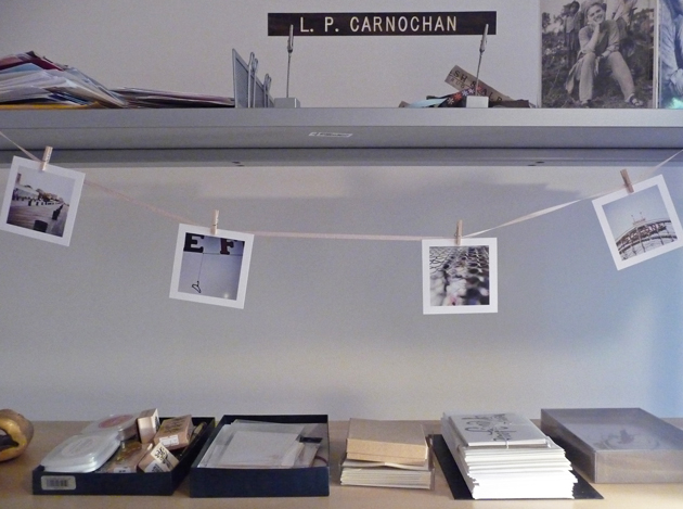
Photos by Cara Forbes. Her print shop is here. I might also want this one, of a Scottish beach.
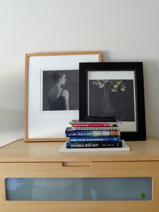
Photos by Brigitte Carnochan, my stepmother. On the left, my daughter from ballet days. On the right, a vase of flowers Gitta gave my son to color, when he was little. Never underestimate the joy of having a real photographer in the family. Gitta’s website is here. My favorite is probably this, of grasses, a palladium/platinum triptych.
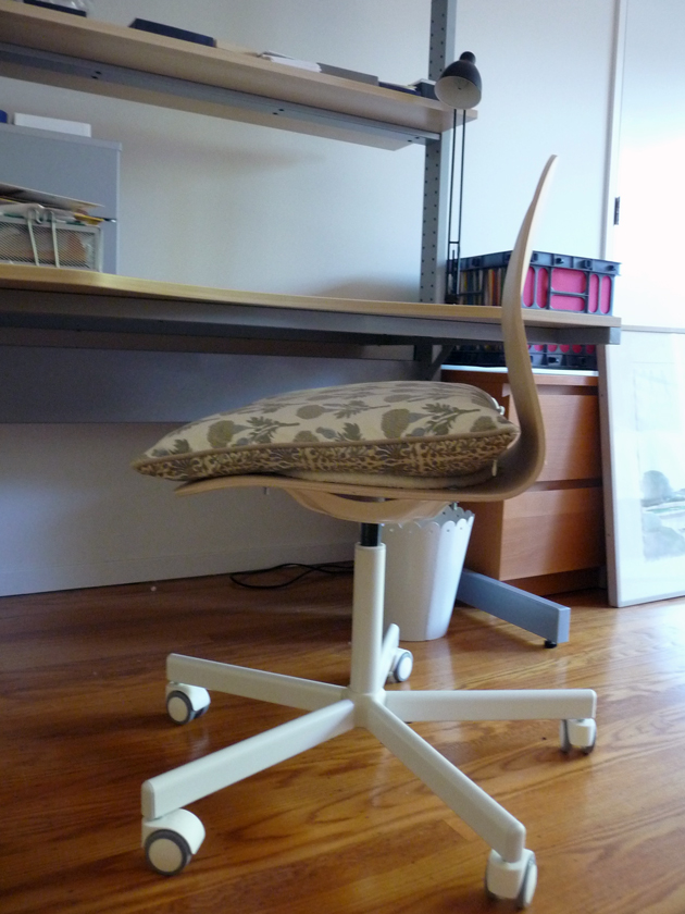
Watercolor on the floor by my cousin, Reeve Schley. A few of his other works, here. And, another Pottery Barn cushion, which used to live on my sofa, but why waste? I’m too old to suffer a wooden seat.
I’m not done here, not by a long shot. But I have an important question. What color should I paint the bookcase? It faces the daybed. Cute 23-year old photo of my children, gratis.
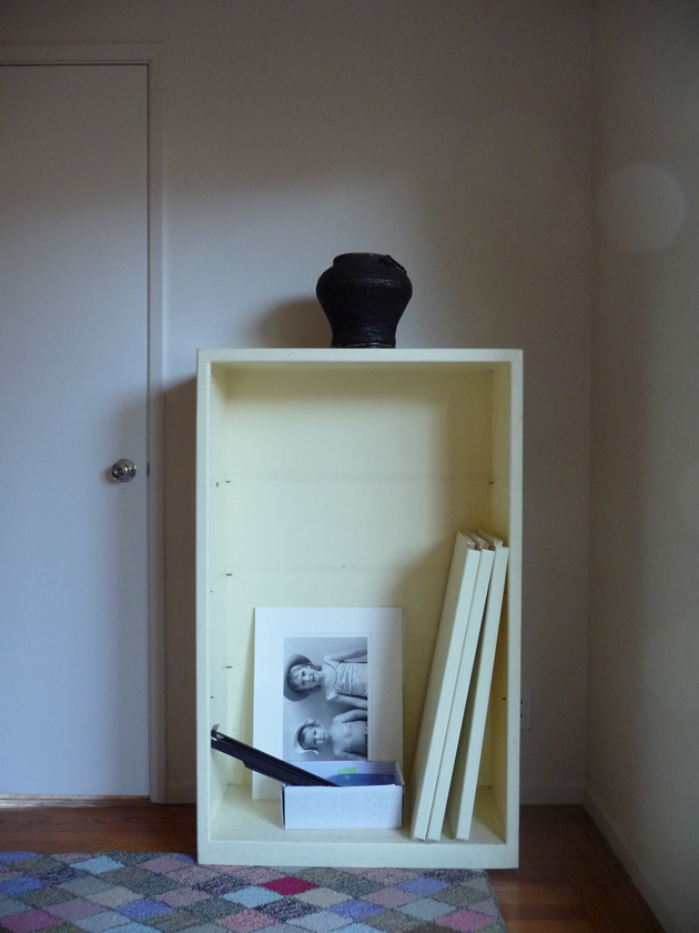
The easy choice would be a neutral shade from the rug, tied to the the Ikea pieces. I considered blue, to pick up the cushions, but blue seems too safe. Had I not put my Lily Pulitzer heritage behind me, I’d Think Pink.
But I’m really tempted by lavender. A dusty, grayed-in lavender. The color would refer, subtly, to the now-tamed purple-gray bathroom tile, and pick up the rug.
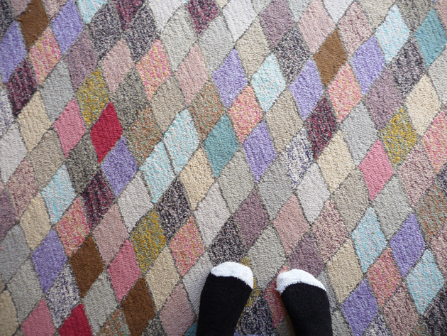
A closeup of Mme. Harlequin. Fuzzy socks, gratis.
I open the floor to you, my distinguished and well-loved guests.
Pottery Barn links are the only affiliate links here, as such they may produce commissions.

84 Responses
I love the idea of a pale lavender gray. And, I love the light in the room!
Thank you! Light, courtesy early morning hours:).
I think I would paint it a light charcoal gray – Farrow and Ball “Railings” for example. I think the weight of it would balance the room out nicely and not be cutesy as a blue or lavender might be.
I love the way the room looks, and the quilts are fantastic together. The rug is fabulous.
So glad you approve of the quilts. I had the brown one just hanging in a closet forever, and since it’s from a very good friend, it’s lovely to have it out and visible.
I agree with Kathy – a light charcoal grey which will also help tie in the Ikea desk. I’d consider painting the Ikea dresser too as quite a few different wood tones going on which might be jarring in a smallish room.
Hadn’t considered painting the dresser! It does match the desk and chair, and it is in that end of the room, so, I’ll see once I’ve painted the bookshelf – which has to be done. I agree about too many different wood tones, what with the chair, and the daybed.
I would pick up the grey from the rug. Soft and a good background for whatever you put on it. No shouting from behind books and objects.
Great rug.
Ha:). Thank you.
So far everyone votes gray, which, I hadn’t considered at all. Why not? In person, the rug in the room reads earth-toned first, then the pastel colors. Gray would take everything in a new direction, given the quilts, the walls, the blonde Ikea wood. Unless it were lavender or blue-gray.
Now I am wondering what I have done in the photography here, alternatively, what I am not seeing in real life!
Go for the lavender! I think it will look great.
Also, I like the two quilts on the bed. They may not technically go together–but they are quilts and they LIKE being together.
Great! Two expert votes for the dual-quilt look, I’m happy!
Ok, I’ve now read everyone else’s thoughts. There are grays that go toward the lavender. I don’t think cutesy is what you want, but unexpected might be in order.
Your thoughts are really helping me clarify what I want. I’d like a light color, because the bookcase is right near the only window in the room, and the desk is far away from the window. I’m looking to reflect as much light around as I can. With more natural light throughout the day, a charcoal would be gorgeous, and sophisticated. But I picked the lightest time, early morning, to take the photos.
And in any case, no one is voting for earth tones, or blue, so, my choice is already simpler:).
What about something like this? http://www.benjaminmoore.com/en-us/paint-color/heaven
@Lisa, very nice, indeed.
:)
Fascinating. I love this. It is difficult to talk colors, generally speaking, and even more difficult to do so through computer screens. I love Kathy’s idea of a gray. When I looked at the room, I was thinking an anchoring neutral that pulled both from the rug and from the desk would be a good look. If you think the Railings color is too strong a gray, how about something like the wonderfully named Farrow & Ball Mole’s Breath? It’s also a gray neutral, but it’s lighter, and it suggests the color of the bathroom tiles you show as well. I would not choose a pastel color, because I think that would make the bookcase “float” rather than anchor it. (We need to come over for tea and color swatches.:) http://us.farrow-ball.com/colours/paint/fcp-category/list?isSearchFilterSuffix=true&results=999&visModel=CHANNEL&filters=COLOUR_GROUP_FILTER_LANG_en-GB:neutral,dark!Hierarchy_TOP_NAVIGATION_FILTER:/TOP_NAVIGATION/wc_shop_all/wc_paint_all/wc_paint_colours
Mole’s Breath was my second choice Katherine.
Sometimes, having something dark (like the bookcase) actually lightens the room by the contrast. In the same way that having large scale furniture in a small room, makes the room look larger, instead of smaller.
@kathy, OK. Very good to know.
I always type my response without reading the others first, so if this is repetitious I apologize. I would opt for the lavender but only on the back “wall” of the book case, if indeed you must have color at all- otherwise I would look for some texture for that back wall, grasscloth or an interesting wall paper. On a different topic, I am hoping that the lamp in the photo is near the ikea desk and chair, otherwise it has a temporary look, I would want something more substantial. In fact, trying to visualize this room as a whole the two parts seem at odds with each other. Wish you could send us a panoramic shot!
@Kathy D., The room is two parts! Think of, for example, a long bedroom that has a sitting area at one end, and is designed to be part of but still distinct. Or a kitchen with sitting area, for that matter. I don’t want the two parts to conflict, be at odds, but I do want a sense of two distinct areas.
The standing lamp is by no means perfect, but I have it, and I don’t have endless funds, so, probably making do for now;). I would do a panoramic shot if I had any idea at all how to make it look right!
I’d vote to paint the inside a lavender and the outside a gray. Best of both worlds with neither one overpowering the space. And I think the lavender would echo the pillow on the bed, if my computer monitor is reading the color correctly.
@Jean R., The pillow is an old lavender gingham from my daughter’s old bedding. As such, it’s temporary, unless I decide I really like it:). Two colors? I clearly need to envision more broadly. Such an education.
I like the greyed lavender of the star in that Garnet Hill quilt (love the quilts, btw).
At this stage, I’d be pretty tempted just to grab a couple of those sample tins most places offer and do a great big swatch of cardboard to try out on the back of the bookcase. If it were me, I couldn’t be sure until I saw it IRL (and I suspect I’m slightly more likely to live with the result if it’s Not Quite, than you might be).
I like the delineation — I’m trying to think of how to redo my home office/studio to make one corner a nest for visiting grandkids, without giving up my beloved “Room of One’s Own.”
Now that we’ve all converged so quickly on gray/lavender, and it’s the degree of one or the other, as well as how dark or light, I agree. Time for some paint samples. And I absolutely didn’t want to make the space so “me” that I couldn’t make room for a guest to stay cozily. It is a conundrum, how to separate a room functionally, and visually, but not, as Kathy puts it, it “at odds” with itself.
What an inviting space! I like what you have done so far with it.
Best Regards,
Heinz-ulrich von B.
@Heinz-Ulrich von Boffke, Thank you, sir!
Lisa – in the end, do what my friend says – Ask (or in this case, select) 3 opinions that you trust/that resonate with you. Sit with each, and then decide based on what your gut/head/heart tell you.
Good luck – and ps – I love the rug, too.
And thanks for asking our opinions.
@Chris, Thank you so much for giving them! PS, I’m glad:).
Ahh, I certainly do have an appreciation for the “eclecticism” that just seems to happen when spaces are moved/ blended/ transitioned over time. In my home, I tend to approach it by looking for harmony rather than cohesion, and thinking about pieces as a layered composition. Through this computer screen, it looks like the dark, neutral wood tones of the daybed and rocker are grounding the space, while the light, bright, soft colors of your lovely textiles lend some buoyancy that really breathes life into the room. Perhaps consider the bookshelf this way– as a piece of “hard infrastructure”, a darker neutral shade like the charcoal suggested above would provide a base layer that allows its contents to shine. If you’re concerned about the overall mood of the room going too dark, I’d only caution against lighter neutrals that may look dingy against white walls. In fact, to keep things bright, it could be quite chic to just use the exact same paint as the walls to freshen the shelf up but let it recede with purpose.
@Cate, Yes, the daybed and rocker do ground the room. In that context, I can see how the bookshelf could do the same. And, of course, what I keep forgetting, is that there will be THINGS on the shelves, which will be dark and light.
i don’t have strong feelings about paint colors here, but i feel quite certain that you should tie those case goods together with plants – succulents, cacti, epiphytes, whatever floats your boat. greenery, greenery all over!*
*greenery, i would add, that needs almost no water.
@lauren, I quite like that idea. Now, question, how much light do such plants require? Because, as I’ve said, this is actually the darkest room in our house right now. I am thinking of getting a skylight installed, in between the bookshelf and the desk, when I, unfortunately, put in new roofing later this summer.
Understanding the space a little better now, Lisa. May we ask for the dimensions of the room? I would suggest doing a little “linkage” between the two areas to bridge the aesthetic difference between traditional and modern- e.g. a library or bankers lamp on the desk, a piece of contemporary art over the bed (lovely to pick up the colors in the quilt, too). You could change the lampshade on the floor lamp, although in my experience a really good lampshade can cost as much as a new lamp. Still, shopping and searching out the perfect thing is part of the fun. Good luck.
@Kathy D., It’s ~11×16, so it’s sort of like 2 little 8×11 rooms, as set up. Measuring not being my strong point;). And I think modern art over the quilts is a great idea, along with the plants, as @kidchamp suggested.
Lisa, check out a Ben Moore colour called Abalone. It’s sort of grey with very interesting undertones, subtle lavender which would play nicely with rug and quilt. Love dual purpose rooms. I’m currently working on guest room/my office since my husband and I recently moved his office/music room to s different space. Enjoy the process.
@barbara broerman, Thank you! I am enjoying it enormously. And, because it’s not a central space, like the living area, nor an every day every night room, like the bedroom, I feel much freeer to play around.
I’d go with a strong charcoal grey. Perhaps take the quilts, maybe even the rug (!) into the paint store and look at the paint chips. The color specialist at my Benjamin Moore is a genius at picking out the right shade.
@Jane, Might just do that.
Looking at the Farrow & Ball palate, you might try Skimming Stone or Elephant’s Breath. And consider painting the ceiling a very light whisper of blue, like Borrowed Light (to stick with F&B since I have their color deck right here).That could pull some of the purple/pink undertones in Skimming Stone or Elephant’s Breath a bit more toward the bluer side of things, without it being LAVENDER. I can’t resist the small world story that I coxed in a boat named for your cousin (or, more probably, an older relative for whom he is named).
@Andrea, Wait, you coxed in a boat named for Reeve Schley? High school? Or Yale? He went to Yale, I don’t know about his relations but they were often also named Reeve Schley:). My cousin is once-removed, or second, or some such, however, and a fair bit older than I am.
And blue ceiling? Here I am all, like, “Wow I’m being so adventurous with color,” and here you guys are like, “Paint the ceiling blue! Do a two-tone bookshelf!” It’s really fun to get these comments.
@Andrea,
Couldn’t figure out how to reply to your reply – it was at St. Paul’s School in New Hampshire. Through the magic of the internet, I now also see that the Reeve Schley this boat was most likely named for had established a fund at the school in 1957 to send crews to the Henley Royal Regatta periodically “to foster contacts between our country and other English-speaking lands.”
I love having a really faint blue ceiling. I was worried that it might simply look like a dingy white, but I’m sold on it now. It just dresses up the ceiling a tiny bit. I’ve got the world’s ugliest ceiling fan in one room, so painted it the same color, and truly, you almost don’t notice it. You should try it!
St. Paul’s – my father and his father went there too. Reeve is a distant cousin, by marriage, removed. However, he and his wife hosted me several times, at their house and at the beautiful Schley house on the river. I am thinking that the workroom may deserve a little wall color, eventually. Or a pale blue ceiling;).
First off check,out Yolo colorhouse paints. We went with a lavender-y purple – I think from their sprout collection – that I love. May be a bit bright for California sunshine. But they may have something you’d like. They have some fabulous blue-grey-greens I love that change with the light. Love their paint!!
@Jb, Would be great to find a very-high quality low-VOC paint. Kelly’s Moore’s has turned out not so wonderful, in the semi-gloss.
I would go with a gray (maybe not too dark) on the entire bookcase BUT… You can use thick posterboard and paint it lavender and cut to the size of the backs of each shelf. If you tire of the lavender or move it to another room you can just toss the lavender cardboard and have a neutral bookcase.
@Kerry Steele, You guys are brilliant. And the professionals are professionals for good reason!
I agree with Kathy D that you need some elements to link the two areas together. The desk and the shelves over it are so modern and spare, in contrast with the daybed and rocking chair, which are weightier and more traditional.
Her ideas of modern art in the traditional corner and some richer, heavier accents in the modern corner sound like a good idea.
Not that you asked for my 2cents on this, but I would get rid of all of the mismatched file boxes and drawers and have one unified storage system. Perhaps that could be a more traditional element on the modern side of the room?
Good luck!
@Kate, What do you think about the tying with plants idea? That’s kind of my favorite right now. But, on the other hand, yes, you don’t the milk crate of files is beautiful? I completely agree. It’s temporary, I’m figuring out what to do in terms of files/drawers. Truth be told, high likelihood I’ll go to Ikea…I just don’t want to spend much money.
I’m a minimalist… I would paint it the exact same shade as the wall to let everything else shine: the carpet, the quilts (love the mix), the art…
Glad you like the quilt mix – I would have said I was minimalist-ish, until now. The rug, and the thought that it’s a studio, have unleashed some inner wishes for color.
Definitely “yes” on the plants. I can’t live without them. If not a lamp on the desk, then perhaps another antique/timeless accent- a crystal inkwell, an antique clock or hourglass, bookends, or one of my favorites -a small stack of leather covered book boxes, which can conceal a multitude of less appealing desk paraphernalia. Promise to post pictures when you have made your choices!
I promise.
on the plants, L (i tried to nest a reply under your reply, without luck; o old browser!), i haven’t tried to grow anything in a zone like yours (northern CA, not a darkish room, ha) for awhile, but i can tell you that the cacti i have smattered around our living room seem quite alright without direct light, and something like a staghorn or two would thrive with very little at all, i’d think. a clever city horticulturalist could probably give you some good indoor ideas (as could celia, i bet).
@lauren, Google tells me low light succulents do exist, so, I’ll do some more research. Thanks.
@lauren, Yes, and most of the santiveria (sp?) family are fine in low light, and with very little water — I have one I picked up at Ikea that I only water once a month. It’s what I use for my now famous “Xmas sticks” holiday tree…
I am in the grey camp also, it will make the bookcase look more substantial in a good way and more contemporary. The standing lamp is a classic; however, I would consider a better shade as that one looks tired and yellowed. A barrel shade in a subtle geometric print would make it look smashing. Have fun, most of all!
@Loretta, Thanks for the lampshade idea, the one in place is definitely seen better days. It is super fun!
I like the idea of a pretty paper background and painted outsides. In addition to wallpaper, you might find something that suits at PaperSource. (Oh, how I wish I were close enough to go paper shopping with you. Then again, probably better for my bank balance that I’m not…)
As for paint, I’m currently in love with Annie Sloan’s chalk paint, and am thinking about projects for it. You can buy little pots, so it’s not a great deal of money, and it’s easy to use and to customize by adding white to get the requisite shade of pale. I’ve just had a look at her US “stockists” and there are a number of places near you that sell it.
Just look at all these lovely colors!
http://www.anniesloan.com/acatalog/Chalk_Paint__100ml_UK.html
Ah, one more thing… about the floor lamp. You can buy a can of matte spray paint and repaint the lamp frame in any color you like.
And you can find inexpensive barrel shades at Ikea. I have a white one that I gussied up with some washi tape and it looks quite elegant, though it is in fact cheap-tastic.
I think I’ll do a lamp post (if you’ll pardon the pun) on my blog so there are a few visuals to go with the suggestions…
@Rubiatonta, Yes, please do a lamp post! I’ll probably keep the lamp metal, just a preference, but I’d love to see shade options.
@Rubiatonta, Or the shade, for that matter.
I’m late to this conversation but like the direction it is heading, but the idea of gray really appeals and looks like it would tie things together nicely. I really like what you are doing with the room so far and it looks very friendly and inviting.
@Mardel, Thank you:).
I was going to suggest 2 different colors for the inside and outside as well – so many pretty lavenders and greys with the rug, quilts and desk!
I am also officially changing the name of my former guestroom turned studio, to my Workroom. Thank you!
@Patsy, You guys give me great visual/design/furnishings ideas and I’ll come up with names and weird phrases in return:). Deal? :)
@Patsy, Deal!
My son graduated from college five years ago. Although he doesn’t live here, he hasn’t moved out either. I would love to make his room into a pretty guest room. We have put people up in there, but it’s hardly pretty,, with all of his stuff.
I think the white is fine. Grey would probably be ok too, but might make the room darker. Would that be a problem? I love the quilts. The rug is pretty too.
Making the room darker is exactly my concern, so I’m going to experiment. And my son graduated from college 3 years ago, I’m just doing this now:). I did get permission.
Minority opinion but I’d paint it the same color as the wall behind it. Unless there is some reason you want to call attention to it? If you leave it neutral, it won’t clash with whatever you decide to put on and in it, and it will recede into the background. Pale gray would be okay, too. Very pale.
@Wendelah, I am just so happy to have my choices down to a short list!
Would the patchwork rug look better oriented the other way?
@Lorri, I’d need a bigger rug:( As it stands now, this size would just look puny, if turned the other way. I didn’t order a bigger rug because I knew I wanted an office chair, and I hate dealing with rug and rolling chairs. But, would been an easier decorating scheme, certainly.
I love this discussion. I completely agree with the plant suggestion, but I’d prefer leafy dark green plants rather than succulents. There are some that do well in low light.
I do want to weigh in on paint. I’m not an expert but I have some,experience with Farrow and Ball. My sunroof is their Orangery, and I love it. But I did some swatches of their light neutrals/yellows in the adjoining living room and they were awful, muddy and depressing. I’ve had success with Donald Kaufman paints. One of his blue-green colors is in our upstairs and downstairs hallways and foyer, and it is wonderful -luminous and changing with the light.
The quilts look great together and with the rug. I like the darker one there because it grounds the area.
I just looked at DK’s correct colors. There are some that you might like for that room.
@Marie, Thank you for the recommendation. There’s so much I didn’t know!
Oh my, I love the bed from your grandmother! The perfect shade of gray seems to be the consensus for the bookcase. Have you considered painting the walls? I like the texture of the baskets underneath the bed and would try to add some more texture to the room, especially in the desk area which could use some warmth. I do like the two quilts on the bed. You’re doing a great job on the room…I look forward to seeing the finished product!
Thank you! I will be sure to show the finished product. And maybe some dark baskets over by/on the desk?
My Mother painted her room lavender (even the ceiling) and the color is so relaxing and warm (it is not very grey, but warm in tone – I do not like grey as my office at work is grey and I find it depressing). It seems like just about any color paired with it looks good and it can go from being feminine to masculine depending on the color and style of the fabrics and accessories you choose.
I look forward to seeing what you do with your space.
Ah, good to know!
I’m a BIG fan of the dusty gray-lavender, but for the walls. (“Heaven”…YES!)
Plus 1) I’d move the red/tan/blue Americana quilt to another room.
2) Get a chunky hand knit looking throw in a gray that echoes the color of the diamonds in the quilt.
3) I’d put a black lampshade on the lamp because I’m a firm believer that every room needs a hit of black.
4) Dark gray for the dresser (“Cheating Heart”, on the same paint strip!)
5) A pillow for the rocker that is like the pillows on the daybed. (You can always buy cheap pillow covers at the new H&M home store for your pillows that might not go as well as you like)
6) Love your personal art/photographs!
My two cents.
Hi there, since I am also for years in kids furniture bussines here in on small Slovenian market, I truly reading enjoyed your post . Bookmarked and sorry we don’t have such masters here in Slovenia. Regards and thanks, Matija