Guys, I’m trying to hang my Christmas presents. I got not one but three new pieces of art, and I love them all and I want to put them on my walls.
From my husband, a family portrait by Ian Gallagher. Not my family, mind you, but one of his Families. Second, from my sister, a print of trees, which are sort of a theme in this house. Third, from myself, one of Kathy Leed’s domestic still lives. You might think that I appreciate each piece less because they all arrived at the same time, but it worked the other way around. They make each other more meaningful, like my own teeny tiny exhibition.
Thing is, I need your thoughts. Kathy’s painting arrived all set but the other two are loose. I’d love to hear your opinions on framing.
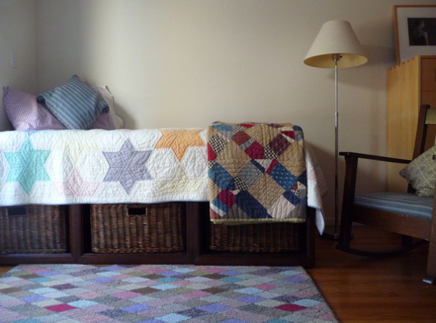
First, here’s Kathy’s painting in situ. (Scroll down to see it on her website, close up.) A lot of impact for such a little thing. I love its wistful cheer. Or maybe it’s optimistic melancholy? Oxymorons forever.
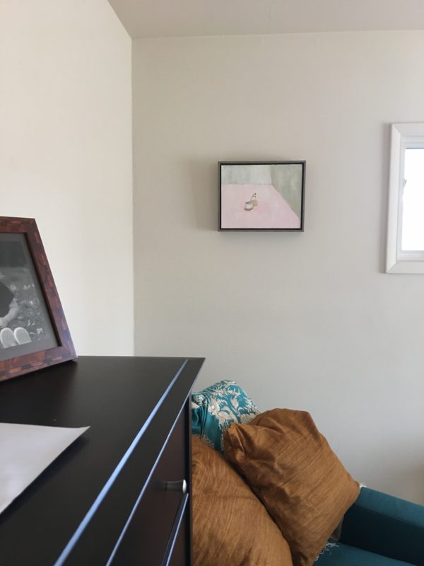
I’ve put it in our guest room, so that as I sit writing on one of our living room sofas, I can turn and see it down the hall. I’m inspired by what Kathy does and has managed to do.
Here’s a old, wider shot of the room. (By the way, I did put two tan-tipped sheepskins on the floor, and while a second rug would have been a fuller solution, I’m pretty okay with how it looks now. Just need new shades and curtains for the big windows you can’t see here.)
My sister’s print will go in my workroom.
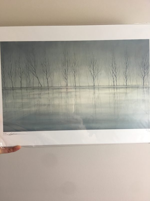
For context, in a fit of impatience last summer I painted the bookshelf in that room lavender gray. While I felt great relief at having finished something that had been in my to-do list forever, the color looks as bad as you all predicted. Ha! Laughing at oneself is good therapy.
May the moodiness of winter trees counteract my full sun foolery.
So, the question is, what kind of frame? How about a crazy 3 inches of chrome? This is what the rest of the room looks like, as I cannot imagine that anyone remembers. And this was the rest of the room back when. I’ve moved things around, and of course cluttered up the desk like whoa.
And finally, Ian’s piece, for our living room. Family.
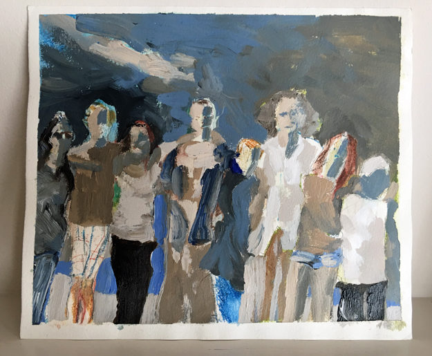
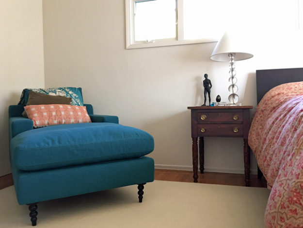
I will be resting it on the mantelpiece like so.
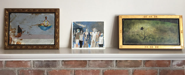
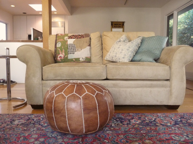
In this room, where the fireplace runs perpendicular to this loveseat, on the same wall as this other work of art.
I’m thinking framed in plain, flat blond wood.
But I would love to hear your ideas. Which, if history repeats itself, I will ignore, and as day follows night regret my intransigence, but hey, we’re friends. To my great relief, we mostly forgive each other.
Have a wonderful weekend. For a wish, how about art?
35 Responses
i’m really pleased with my framatic brand frames, which do come in blonde wood:
http://www.aifriedman.com/Framatic-Woodworks-Barn-Grey-Frame
in fact, i have a similar-ish tree print in that very blonde wood frame staring at me now, which is perhaps why i felt compelled to comment!
@afro_me, I love those frames, the way they are so raw. Thanks.
Hello Lisa, Lucky you to have a problem like this! I think that the trees picture should be framed in thin black wood, without too wide wide of a mat, which probably should be white or perhaps grayed, but not a colored one. The black frame will be classical and will complement the mood of that great print.
I agree with your idea of flat blond wood for the Gallagher, which is lighter in tone, and more modern, and can accept some color input and a little robustness perhaps from the frame.
–Jim
@Parnassus, I love hearing your finely tuned thinking. Thank you!
The *Family* frame can go in many directions, but the *Trees* in chrome?
Instant gut impression, kayaking silently alone in winter mist, one comes upon these leafless, submerged trees. The oak of my good wooden paddle is the only frame I see.
@Rosie, What a lovely, lovely image. <3
No no no Lisa not blond wood for the family painting! You have so many choices for this painting, because there are so many colors in it! I think you want to place it on an even larger heavy white piece of paper or surrounded by a floating matte and then select one of the fantastic colors (even that bright green could work, but there are blues and grays and whites in abundance) for the frame. The rich colors in the painting cry out to be replicated in the frame, so that the frame is truly an extension or an integral part the art, not simply a ‘frame.’ Know what I mean?
For the trees you can go plain black or plain silver in a wood frame, no chrome, and it will be lovely.
My two cents!
@Amelia Silver, Thank you so much for commenting! I hadn’t even considered color in the frames, that’s a whole new realm. I think I’ll ask Ian what his ideas would be for that. It’ll be interesting to hear, no matter where I wind up. And I am sure you are right about the trees;).
O how I love Ian Gallagher’s work! As for hanging, i’m of the salon school, all work interesting arranged to the ceiling and blanketing every possibly space! One thing I will not brook: blond wood; it’s the devil’s work–steer clear of it!
Take them to a GOOD frame shop with a reliable staff. Trying various corners of molding and possibly mats will often result in a beautiful pairing of art and frame you wouldn’t have thought of. Don’t stint on size – you may or may not want to mat these pieces on paper, but you might also float them on a background of a quiet color that could bring out their best.
Also take into account is what else is in the room. It’s best if materials in the room talk to each other – helps relate an eclectic collection. So take a photo of the other mantel art with you when you frame the family pic and try to make them get along. And the cozy feeling work room materials suggest anything other than 3 inches of chrome LOL.
My guess is that something dark yet delicate would work for the trees. Can’t tell on screen-pure black might be harsh or just right. You have lots of ways to go with the family painting – light wood, dark, something related to the interesting colors, or good makers like Larson-Juhl have some nice, non-tacky, contemporary gilded frames that could help it talk to its neighbors on the mantel (that last could be wrong too – just hold up the molding corner and see). Don’t get stuck on a theory-try things, and see… Have fun!
Hi Lisa, I’m inclined to agree with Wendy in that you need to go to a quality framing store and let one of the designers help you. Even though you may not actually buy a frame from a particular store you can at least gather ideas in this way.
Another idea is to invite a friend in (with great taste) and have them give you their ideas.
If the above fails trust yourself. You have great taste.
Luci
No opinion about the first picture, other than to say I like it, but I agree with those before me that the family portrait deserves better than a plain blond frame.
Your other frames have texture and interest, so don’t go plain with this one. I think the picture would be better displayed with a mat but you don’t have mats on the other pictures – maybe you’re not a mat person.
I have a peeve about receiving gifts that should be framed but aren’t because framing is expensive to the point that one can feel like they only received 3/4 of the gift. Since these images mean something to you I say go to a framing shop and let them help you out.
to Rose’s point. Many times the framing is more costly than the art. And that can feel like it is less than a gift…maybe more of a new project. However these were given by family and one assumes with love. So look at lots of options and you will know it when you see it. Eclectic is so much more fun. Happy day!
OK, I think Kathy’s painting is way to intimate to have that dark frame around it. I’d do light wood or pale color if it doesn’t overwhelm it.
The trees. I’d add more room (paper) to let it float and breath. Maybe let it just float and cover with glass. Seems so ephemeral to me and wants to stay that way.
Family painting needs larger matt. Again to let it breath and then a wooden frame in the same taupe colors as the painting.
Now take it to a professional and see what they would do.
Emjoy! Sandy
Sandra – it’s actually a very bleached out light grey, but for some reason, photographs dark? I agree it doesn’t look right.
Wendy is right – a good frame store, experiment with frames and matting. Dark and delicate with the trees sounds good. I would experiment at the frame store with the family; be sure to see how it looks with a dark red (or whatever that color is in the painting).. They’re all wonderful pieces.
Frames and mat can or break a picture. I’ve taken much joy in bringing a painting to life by careful choices in colour and materials. Repeating some prior advice from others – spend time in the framing shop playing. And don’t be afraid to use two or more colours in the matting.
One trick I’ve learned with several watercolours I have – treat them a bit like a specimen box. Because they’re essentially an object on white paper, they are “floated” on white mat, big border, then a deep frame (so it’s a box). Frames tend to be either plain wood, white or black (depending on the picture). But it makes for a very dramatic focussing on the picture itself – the frame just holds it in space.
Thanks for featuring my piece, so pleased you have it along with your other beautiful artwork. I agree with others…to have the framers help you decide. Art should be framed for the piece itself, not for what “goes” in the room (within reason). I agree with Sandra’s ideas for sure, about matting and giving the pieces room to breathe. A good frame shop will really be able to help you by putting corners of matting around pieces, whether paper or linen, and then with the frames next to them.
Anyway, that’s what I always do. xo
I got nothin’.
I love the art and am looking forward to seeing how you decide to go.
I’m an artist and I never choose frames for my own work or for any of the unframed art I collect. I leave the framing up to the framers because they’re the experts. Maybe I’m just lucky, but I’ve found very good framers over the years, and I’ve never been disappointed in their suggestions. It costs considerably more than buying a stock frame but it’s totally worth the cost because the results are so outstanding.
I think Sterling Arts in SF is an amazing place to ge things framed. It is the only place my friend who used to work for a Manhattan art gallery will use. Call and make an appointment.
For me, going there is like having a dress made by someone with impeccable taste. I recently had a large photo print framed and it was a lengthy consultation. The person I worked with suggested a colored frame to complement the picture and floating the print. Not the direction I had anticipated, but I love it more than I can say.
Enjoying reading the comments, but can offer you nothing. Did I ever tell you the only class I ever failed at Berkeley was Art History? So would be less than useless at framing any.
Let us know what you decide. I’m sure it will be lovely and do the pieces justice
xox
You’re getting a lot of recommendations to float. A couple of examples in case you don’t know what “floating” means:
Floating a print on a generous ground, without a mat: https://fadoantiques.files.wordpress.com/2013/10/dscf2133.jpg
Floating a print on a narrower ground, inside the edges of a mat: http://www.designsinkart.com/library/WAM-FloatingDeckleEdgedWatercolors201310_files/image028.jpg
I work for a private art collection, so dealing with framing is a big part of my job. And, I think, there are basically two ways to do it. The first is, as several others have mentioned, to go to a very good frame shop and work with the designer there. This will not (well, should not) be cheap.
If you don’t want to spend $500 or more (and that’s the ballpark for the sizes you have), then go to Ikea. You can get custom mattes cut at a frame shop, and that will do an incredible amount, and slip that into the $10 Ribba frame and it will look lovely. The quality of the Ribbas has gone down, though, so maybe check out the other lines, but Ribba really used to be the go-to cheap frame for a lot of art people.
Don’t waste your money on mid-range frames. Definitely don’t buy stock frames from places like Pottery Barn or their ilk. Either go very cheap, with a custom matte, or go for the top end. Some very good frame shops sell some standard sizes, and that can be a good deal if your art fits (and again, with a custom matte, which is not expensive), but otherwise, the middling frames aren’t worth any premium over Ikea.
Since you asked –
For the family portrait, which is a very bold piece, I’d go with a floating mount, which means the work would look like it’s elevated a bit from the backing, floating. White. I’d do that so the frame/matte does not compete with the image. I like the blonde wood idea around it.
The trees, the palest dusty rose matte board as a slight contrast to the trees. Or the opposite, a dark slate grey if it doesn’t look too heavy on your wall and overwhelm the piece.
Framers are really good with suggestions too if you take your pieces in.
Of course, whatever you decide in the end will work because these are beautiful works!
If that painting is going to sit along side the others on the mantel, why wouldn’t you stay with the gold frame theme?
Besides, gold compliments blue like no other color.
I would frame the picture , not decorate where it is going . You may move them around later – or even move yourself . I like your idea of chrome for the trees but would have it narrower than 3″. It does need to be subdued so grey stained wood or a tarnished (usually called oxidised) silver would work I think . I agree that black is too harsh but unshiny white might also work . As to the family I agree with most that pale wood would not be best but it isn’t positively horrible – particularly if you go for pine which darkens over time . Otherwise dark wood or reddish brown would pick up the warmth in the picture .
I agree about a good frame shop. Nothing beats looking at frames. But often more important is the mount. The colour of that needs to be determined by the colour of the image. It may be white or cream – or it may not. The important thing is to be generous with the mount. As long as it isn’t ridiculous, the bigger is generally the better. It will focus attention on the image. And the frame can be relatively quiet so as not to distract attention.
Lovely pictures all! If you can splurge, go to a custom framer and use acid free backing and matting. For the Gallagher, perhaps a light blue or beige mat with a blond wood frame. For the tree print, maybe a light grey mat with a silver frame. The framer will bring out an assortment of choices and you can play around which is part of the fun.
. I’m a quilter and fabric addict so although I do like your new art collection, I love your quilt display. Can you share their history?
All so personal, yes? My personal call is to do as little colorwise to the trees’ mount/mat/frame so that the luminous quality coming from within isn’t diminished by selecting arbitrary color to “bring out” something. Again, my personal call regarding Ian’s work is to stay away from color entirely in the mount/mat/frame you select, let the intent of his careful color distribution stand alone. Moreover, another personal call would be to preserve Ian’s surrounding edge, I value that edge highly. Just all so personal…
On tree print: You don’t really need a separate mat – the large white border surrounding the actual image is sufficient, and extends the image beyond its actual edge. Then go for a classic thin black wood frame, for definition. Or try a silvery-grey frame, for a softer definition, which would perhaps be more in keeping with the other colors in that rom.
On “Family,” there are several questions to ask yourself before considering any frames: 1) How large do you want the finished product to be? 2) What relationship do you want “Family” to have with the two very distinctive (and very different) art works on either side? Do you want to evoke the continuity of colors and possibly of frames, or stress the modernity of “Family” against the more traditional or mysterious elements of the surrounding works? 3) Will “Family” always be perched between the two, or might you move it elsewhere at some point?
I’m assuming that “Family” is an oil or acrylic painting, and will not have glass covering the image – so some of the framing suggestions made in these many good comments may not be workable. But I hope they have all opened your eyes to the possibilities available beyond “flat blonde wood” (or should I say, “flat bland wood”?).
Now hie thee to a good framer, taking a print of your proposed mantel display with you! And let us know how it all turns out …
Honestly I have no advice to offer you on the framing but I love all three works of art. They are wonderful and will bring you much enjoyment. How fortunate you are to have them. Have a good week!
I’m late to the game, but I have framed a fair number of pieces in my house, and what has worked is: Go big or go home. It’s amazing what a striking frame can do to draw the eye to the art work. Look, all you have to do is go to a framing workshop and take a right angle sample of some shocking honker large frame and just have a look at what it does to your artwork. Live life on the edge. Good luck.
Whenever I’m fortunate enough to have a piece of art framed by the artist, I’m inclined to respect the artist’s choice as part of the “provenance” of the piece….your beautiful Kathy Leeds work might benefit from rehanging rather than reframing to enhance the intimacy of the work. This could be as simple as moving it down on the wall, nestling it between the window and the chair, to invite that close “conversation.” I otherwise echo others’ comments on the value of a good framer for suggestions.